ArdentCode Brand Strategy
The core strategy for the re-branding of this leading team of seasoned developers, solution architects, analysts and designers from Poland was derived in a one-day, in-person, Resonaid brand platform session in Los Angeles. The focus quickly turned to the company's admirable culture. 3 supporting brand pillars were established, which educated the naming strategy and the icon design. The strategy work further created clarity in positioning and messaging and after a successful re-launch event held in Poland, Fabian Geyrhalter, Principal of FINIEN remained on board with ArdentCode as an executive brand strategist.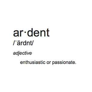
ArdentCode Naming
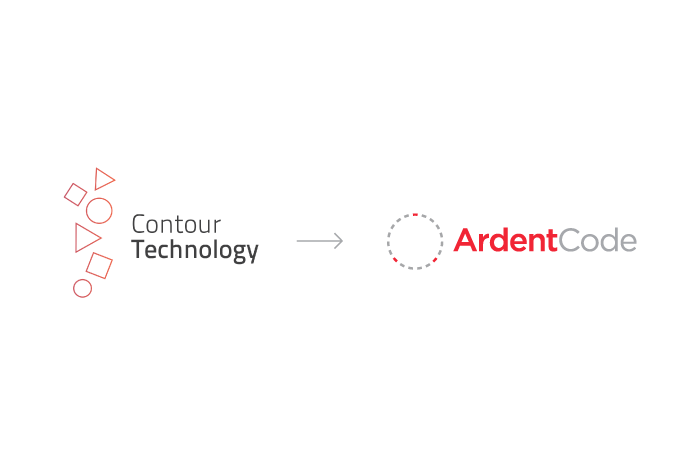
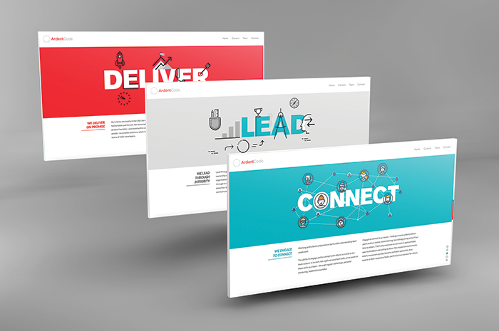
Contour Technology, as ArdentCode was named for 16 years, knew its name had to hone in on the brand's newly defined pillars of 'Connect/Lead/Deliver' while standing apart from other software development firms in the U.S. and Europe. Using the rare word 'ardent,' we encapsulate 'connection and leadership' while adding the very to-the-point word 'code,' which further infuses a subliminal second meaning: a tightly knit team that is swearing by its work and sticks together as if they are using their unique communication channel.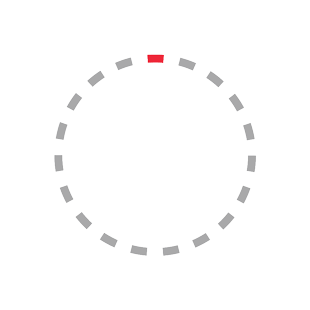
ArdentCode Identity
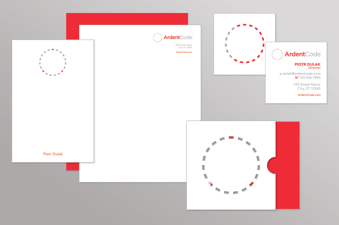
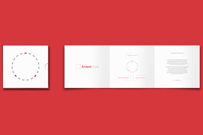
Minimalistic design language is used to allude professionalism while remaining elegant. Movement directs the eye towards the round icon, which is dotted to represent a chain of connection and algorithmic precision. Three points were highlighted with ArdentCode red to emulate the company’s drive to ‘Connect, Lead, Deliver’, which also visually connects to create the letterform ‘A’ for Ardent.Working with Fabian and team FINIEN on our re-branding journey was like putting on glasses for the first time: Everything became clearer, had more focus and appeared more colorful.
- Peter Dulak
Founder