Tag Archives: Brand Launches
Launching Brands Online in 2013: One Step Forward, Two Steps Back
I am sick. And it’s not the flu.
I am sick to my stomach looking at all those amazing new ideas from sharp entrepreneurs going up online. Ideas that are as varied as they could possibly be, all nurtured by a revolution in online fundraising and fueled by an economy that is looking for the next big thing. Many of those ideas I see are truly revolutionary, but it still makes me sick looking at them. They all seem identical and I can not differentiate one site experience from another.
The internet gave entrepreneurs the ability to use cheap, often free, templates and it happens that everybody chose the same ones. I can’t blame them, these are robust templates taking advantage of responsive web design, while being equipped with all the features necessary for most entrepreneurs this day and age. They look and feel modern and they represent what I’d call a MVW – A Minimum Viable Website.
One thing gets lost though, sometimes is even missing from the get-go: A big brand entrance through a unique visual language that differentiates the brand enough to stay in the audience’s minds.
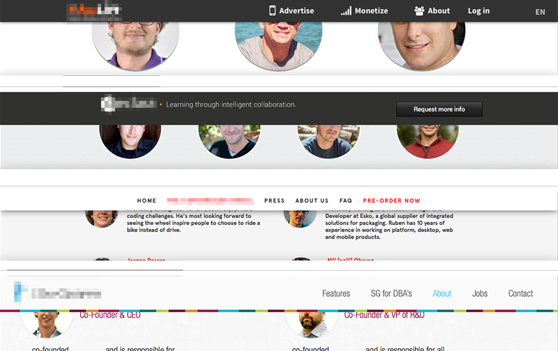
Above: Four startup sites I came across recently. Who is who? Which product is which? Wait, was that the site of that company I liked so much?
Conceptual and visual creativity used to be the integral ingredient of any brand introduction in the heyday of printed communications – they now are missing in action. To many of today’s entrepreneurs it is the product/service idea alone that counts, but sadly that idea gets lost without being embedded into a branded environment. The internet provides free tools; it does not mean that those fit into your company’s launch strategy. Leverage them when appropriate, avoid them when launching a brand. Consumers will get lost and your unique idea will look like a standard idea by using standard templates.
Be bold, be different, be conceptual. Go ahead and inject your enormous amount of creativity, strategy and moxie into your online presence, because it will be the place most people will meet your product/service first. And as far as I can tell it’s anything but standard.
CATEGORIES: Blog Your Brand Launch: Digital
The Main Obstacle That Stands Between You And A Successful Brand Identity
You created a robust business (or launch) plan and a solid brand platform. You hired a great branding firm to tackle the important task of creating a brand identity on time and on budget. What could possibly go wrong?
There’s one thing that can come between you and a winning brand identity: You.
Before you start your hate mails, think about it with me for a second. You have superior taste in art and design. You know your new service or product better than anyone else. You need to see it succeed. How could you possibly turn into a road block? Because of exactly these reasons you will want to create a brand identity that you will like. Colors that speak to you, shapes you like, a concept that resonates with you, fonts that feel current to you. That’s a whole lot of ‘you’ even though this is not at all about you, it’s about Julian, Rich and Adrienne. Your target personas. What you need to like is that your new brand identity will resonate and be liked by them.
Will you like the new brand identity design? You surely should. Does it matter if orange is your color and that you prefer sans serif typefaces? No, it does not. Nor does it matter what the Designer or Creative Director ‘likes’. What matters behind every creative decision is why it was made and how it will further improve adaptation by your customer. This is extremely difficult as an entrepreneur, or even CMO, to personally detach from, but it is what will make the brand ID a success for your audience and in turn for yourself.
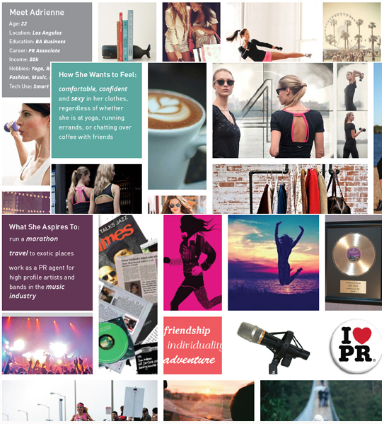
Meet Adrienne: Excerpts from a Brand Platform for a FINIEN client depicting Target Persona A
We advise our clients to dive deep into 3-5 target personas with us. We give them names, research and ‘listen’ to them. We encourage our more advantageous clients to create life size cardboard figures of them to place around the office. Next time you nod your head during a creative presentation and say ‘I like this, the colors are beautiful, the type is cool and the concept really resonates with me,’ take a step back and say ‘Adrienne would really like this, these colors disrupt her world just enough to stand out and I see her adopting the icon easily.’ You will like what you see say.
CATEGORIES: Blog Your Brand Launch: Identity
Maximize Your Tagline When Introducing a New Product or Service
Just Do It? Not so fast we say.
When introducing a disruptive, innovative or different type of product or service to the market, your tagline presents a huge opportunity to convey not how the new brand makes you feel, but instead what it actually does.
Using a descriptor in place of a traditional tagline can get you further, faster at the time of your launch. You can, and should, over time transition into a tagline that dives deeper into the emotions consumers should feel when using your product or service. For Nike, a descriptor may have been something along the lines of “Peak Performance Running Shoes Driven by Design,” and as the brand gained traction, it would have eventually changed to the famous three words “Just do it.” 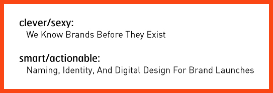
Our brand consultancy nearly launched with the tagline “We know brands before they exist” (which I felt was clever), but decided to hold off and use it only in company presentations instead. As our offering is highly specialized and unique, we now clearly spell out what we are in business for: “Naming, Identity, and Digital Design for Brand Launches.” It enables us to immediately set expectations with our target audience whereas a clever tagline would have been just another piece leading to the actual answer your target is seeking: What is this new brand doing exactly and is it what I am in the market for?
An additional startup benefit? If you choose the descriptor path, there is no need to get overly creative; just clearly spell out what your brand delivers to its user in the simplest, shortest way possible. It’s not sexy, but they will be grateful, and so will you when looking at your incoming leads.
CATEGORIES: Blog Your Brand Launch: Brand Strategy
New Brand Adopter: Alex Osterwalder adopts Sifteo

Alex Osterwalder is the lead author of the global best seller Business Model Generation and inventor of the Business Model Canvas. Currently, working on Strategyzer.com, a strategy and innovation platform. Blogging at http://www.businessmodelalchemist.com
Our burning question: Which recent brand launch do you admire?
“I was pretty impressed by the launch of Sifteo Cubes. The online presentation, the packaging, and the product itself are great. I’m a big fan of the “unboxing experience” I got used to with Apple products. Sifteo provides the same for their cubes. The packaging is so beautiful, well designed, and practical that you can only love unpacking their product. So what about the product itself? My kids, the final users, simply love playing with the cubes.”
FINIEN Weighs In
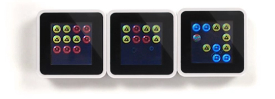
We did not expect anything less inventive coming from Alex after hearing him deliver the keynote address at the Front End Innovation Symposium in Boston two weeks ago, Sifteo Cubes are just plain cool. “Sifteo Cubes are small computers that display graphics on their top surface and sense one another and how they are being moved….were developed as a platform for hands-on interactions with digital information and media (Wiki)” No surprise that they were derived by two MIT grads. OK, let’s talk brand.
The Name
We love names without preconceived notions. They eliminate domain name fights and they are ready to be branded by the sole marketing of themselves. Sifteo is easy to say, but it’s not the easiest to remember. For a kid, it’s not sticky, a kid wants something fun to say that evokes an emotion or recollection of the product. Sifteo sounds latin, which is to say rather serious. So what does Sifteo mean? It is not clear if much sifting is going on, unless we go deep down into metaphor abyss of which we will spare you. Siftables was the name of the prototype product, which must have turned into Sifteo, the company and then Sifteo Cubes, the product. What’s next? If their product offering grows in the future, will all product names be sifted through the same siev? Matching names between a parent company and its product lines can limit expansion opportunities and create a dynamic between products in which successes and failures hinge upon one another. A short term solution that is missing long term naming and expansion strategy.
FINIEN Brand Happiness Barometer: Name 2 (out of 10)
The Identity

The identity design is as uninspired as the product itself is inspired, and inspiring. The type is bland (very ‘techie’), the colors are expected and as a combo it simply fails to stand out. The attempt of a somewhat, not really square typeface could have been explored further and as such starting with the letter ‘o’ (aka a real square) a story could have been told by integrating the three cubes (aka the product) into the logotype. It would have served as a strong foundation of the brand identity as a whole. A lost opportunity.
FINIEN Brand Happiness Barometer: Identity 4 (out of 10)
The Digital Design
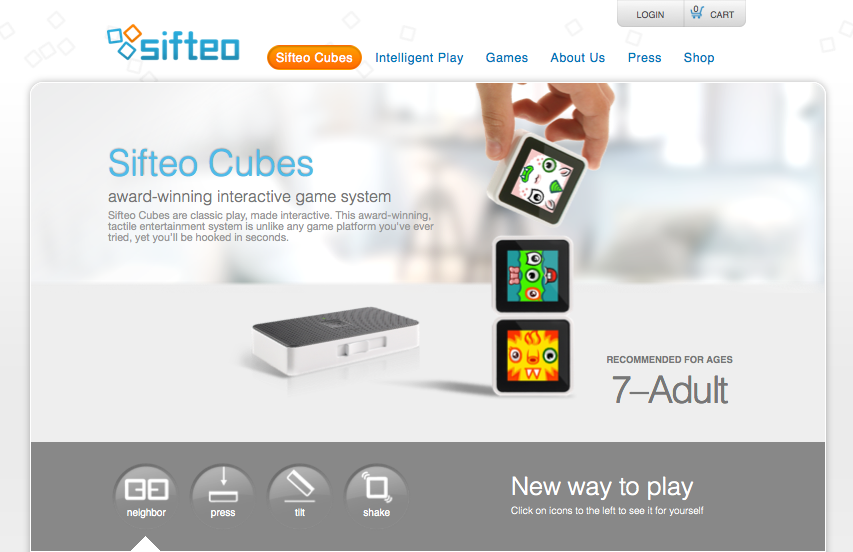
Alex praised the packaging, to say the least, it nearly sounded erotic, so we take his word for it. From the outside, the packaging takes the same straight forward, clean and product focused path that the web site promises. The online experience often being the first touch point of parent as well as offspring (aka ‘end user‘), the site fails to connect with the target audience on an emotional level though, may it be with the kids looking for a fun and engaging element or the parents looking for an online experience that matches the product price point. An experience needed to be crafted and content catered to a specific audience. The sifteo web site feels like a site where strategy and design were derived by an overwhelmed developer and content strategy by the sales team. All of it organically, so it seems. With that being sa(i)d, we do prefer its clean and to the point design over bad design and UX altogether. Gotta go and play with these shiftable, ah, siftable cubes now.
FINIEN Brand Happiness Barometer: Digital 7 (out of 10)
CATEGORIES: Your Brand Launch: Brand Atmosphere
The top 5 must-do’s for your tech startup brand launch
![]() Jason Calacanis, founder of Silicon Alley Reporter, Engadget, TechCrunch 50, LAUNCH, This Week in Startups as well as his new venture, Inside.com, asked me ‘What are the most important things you’ve learned about launching?‘ Here is what I wrote him:
Jason Calacanis, founder of Silicon Alley Reporter, Engadget, TechCrunch 50, LAUNCH, This Week in Startups as well as his new venture, Inside.com, asked me ‘What are the most important things you’ve learned about launching?‘ Here is what I wrote him:
1. PICK A PROCESS
There are many processes to launching your tech startup. Choose one that works for your personality, budget and within the culture you are about to create.
2. TEST AND FAIL
Test and fail and test and fail. You should invest in creating your brand only once you really understand your target audience’s behavior and true needs.
3. LAUNCH AS A BRAND
Launch as a brand, not a startup that may develop into a brand. Launch by design. Design relates to the process you have to adhere to, but furthermore it truly is design that holds the key to early brand success. Graphic design, brand identity design, and web design will set your offering apart at the time of launch.
4. TAKE NAMING SERIOUSLY
Naming is crucial. You can’t change the name of your kid once they are in puberty. The name you choose at launch will remain with the brand forever, so don’t settle for a placeholder name that just happened to make it into beta because the domain was available. It’s an art, science, and legal matter, so make sure it doesn’t get overlooked.
5. LISTEN SELECTIVELY
‘Opinions are like @**holes, everybody has one‘ – choose wisely whom you listen to, which opinions you implement, whom you exclude from certain conversations and why. Have a ‘stakeholder opinion plan‘ in place from the start to make it easy for you to adhere to and eliminate the unease of hurting people’s feelings or having to re-do certain phases of your project because you did not listen to the right people at the right time.
Chips Ahoy VS. Wholly Guacamole

Two punny names featuring a product mixed with a popular saying.
“Ship ahoy” (old nautical shout-out) plus “chips” (as in chocolate chips, no relation with guacamole, salsa and such) equals “Chips Ahoy.” We just realized this is a pun ourselves – one of those things you see around all the time and suddenly you become aware of the concept behind the name.
The term “Holy Guacamole!” is a slang term which basically means “OMG,” but you knew that. This brand of guacamole prides itself on not using preservatives and keeping the product 100% natural. There’s also a taco place here in sunny Santa Monica called ‘Holy Guacamole’ – but Wholly Guacamole is taking it up a notch on the pun barometer.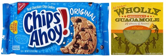
Our first Punny Brand Name Showdown is a tough one to judge as both are quite clever and memorable, but OMG!, Wholly Guacamole takes home the whole enchilada based on the double layer of pun mixed with a product attribute. Chips Ahoy makes us aware of chips coming our way, which is a great thing, no question. But, Wholly Guacamole tells us that it’s, well ‘Holy guacamole!’ (not too specific, it may be great, it may be spicy…it may be all those things) as well as a natural product.
CATEGORIES: Your Brand Launch: Naming
The Name-Letter Branding Phenomenon
Did you know that your name can have an impact on everything from your day-to-day decisions like which candy bar you prefer to some of your most important life decisions like the career you choose?
“If a brand name shares our initials, we tend to like it more,” says Miguel Brendl, Professor of Marketing at the Kellogg School of Management, who has taken an interest in studying the complex relationship people have with their names and brands they purchase.

It is no coincidence that there are an unusual number of Dentists named Dennis. Women named Louise are likely to move to Louisiana, and Craigs like Coke while Peters prefer Pepsi. Is it any coincidence then that I am running FINIEN and my name is Fabian?
Read more about this interesting phenomenon here.
CATEGORIES: Your Brand Launch: Naming

The Post Host
Fabian Geyrhalter is the Principal of FINIEN, creating clarity for brand transformations.
JUST RELEASED
Key branding lessons to save time and money while winning hearts and minds.
CRITICALLY ACCLAIMED
How to turn any venture into an admired brand
THE #1 BESTSELLER
How to Launch a Brand