
PocketNote Naming and Tagline
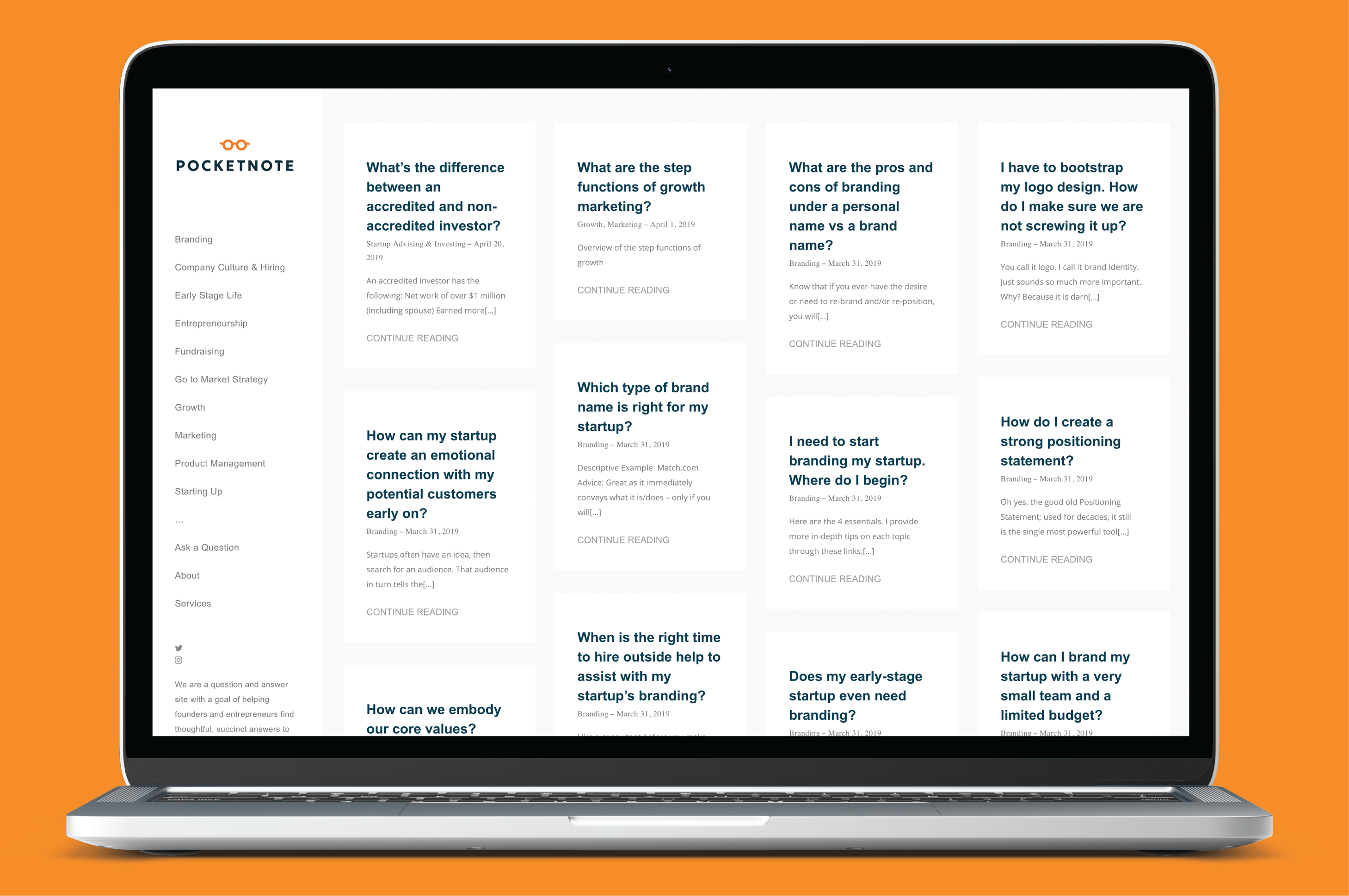
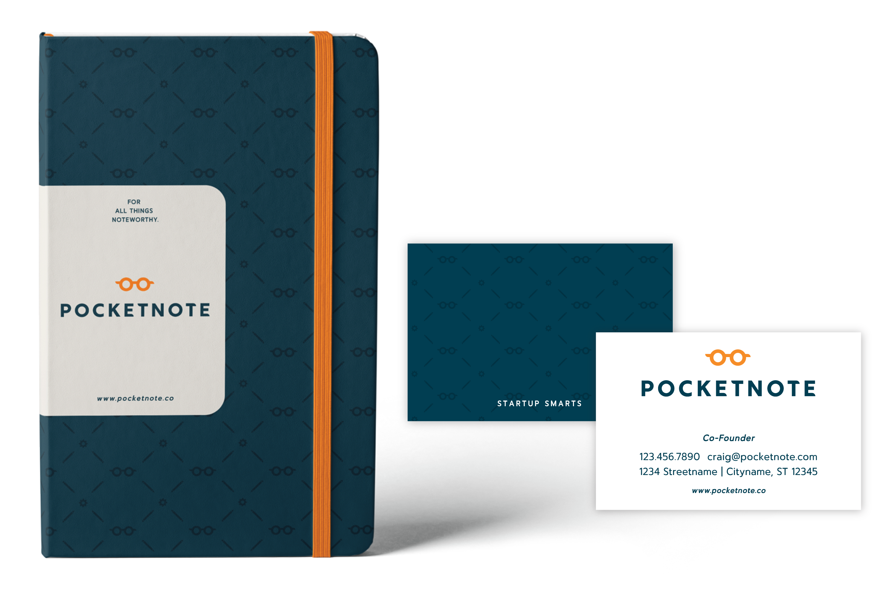
We knew this name demanded to be simple and easy to recall. Given that PocketNote provides quick clarity and insight, we imagined the user reaching for their phone in their pocket when they are in sudden need of an answer. It is the little black book, the notebook, the holy grail to helping entrepreneurs through their challenging startup journey. 'Startup Smarts' turned into a 2-word tagline adding personality and meaning.
PocketNote Identity
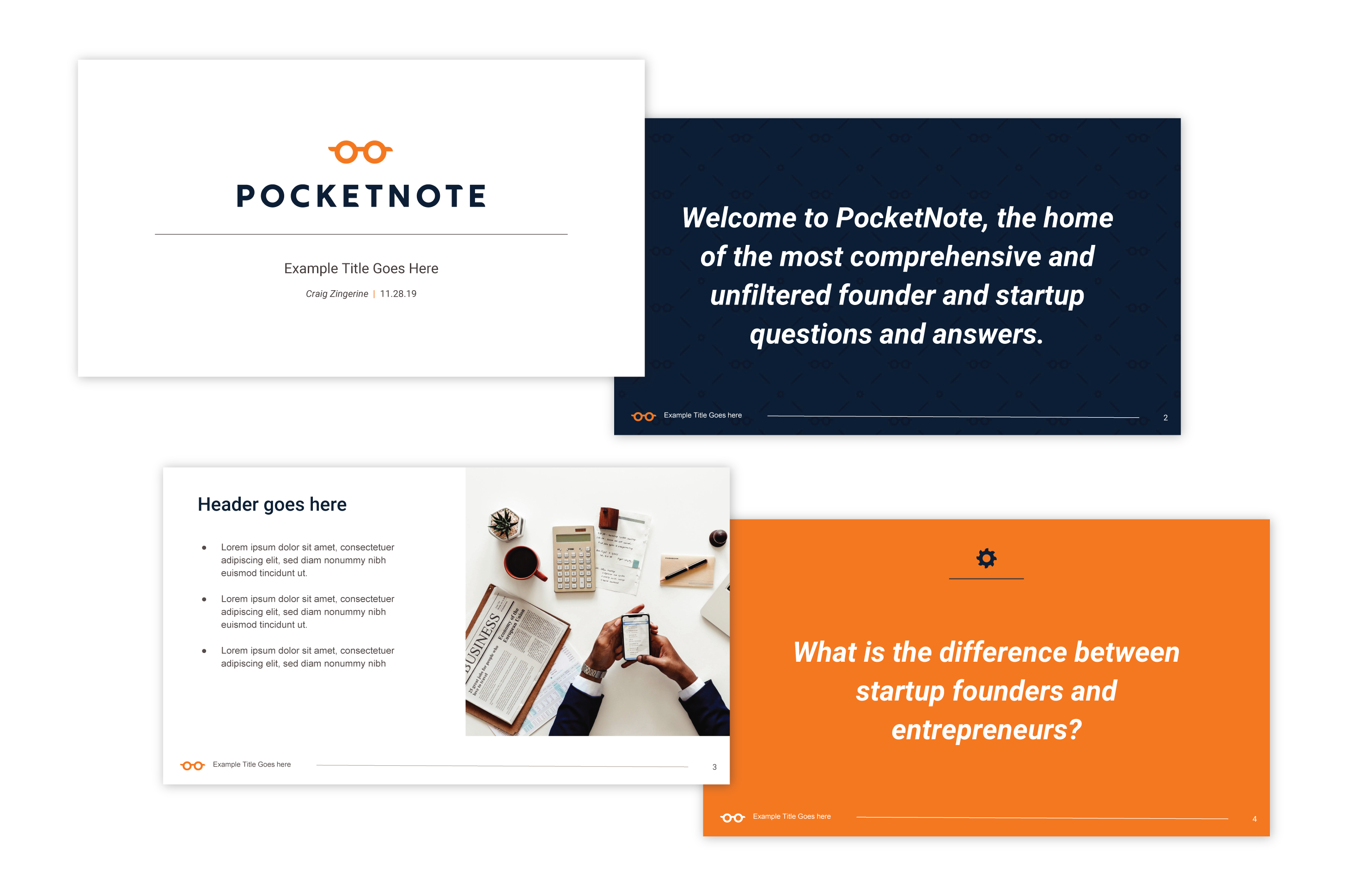
The PocketNote identity design tells the story of the relationship between experts and those seeking their advice. A strong, simple sans serif typeface was chosen for its bold legibility and cleanliness. The reverse of the rounded edges that flows through the icon and typeface gives off a playfulness to resemble the duality action of a Q&A. The two perfect O's that represent the expert and the startup founders are taken out of the typeface to come together and form spectacles; a metaphor for the essence of what PocketNote does: to provide clarity and quick insights to founders, startups and the questions that keep them up at night.Their ability to hone in on a perfect brand quickly stood out to us. The fact that our brand is fun yet serious, professional but not boring, and the logo and identity leaves a lasting mark on first glance is nothing short of amazing.
- Craig Zingerline
Founder


