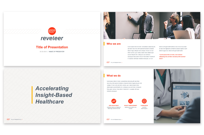
Reveleer Brand Strategy
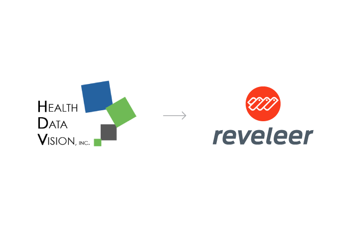
Health Data Vision (HDV) is an Inc 5000 company that provides software to manage quality improvement, risk adjustment, and compliance initiatives for the healthcare industry. When HDV approached us, they knew a full re-brand was necessary to signify the big change from a service-based firm to a technology provider. Through the in-person brand strategy workshop the new brand's why, how and what was being clearly defined in a single day. The product description gained clarity as 'a hyper-connected platform,' while the mission 'to provide transparency, choice, and control within government-sponsored healthcare' created a bigger purpose that is rooted in the newly derived brand DNA of 'community.' The reason of existence, or 'the why' of this Glendale-based brand, was summarized in one powerful statement: 'To accelerate insight-based healthcare.' The resulting brand summary empowered internal and external communications as Team Health Data Vision was getting ready for the brand re-launch, while it formed the strategic foundation for the next step in our brand work: Deriving a new name for the fast-growing brand.
Reveleer Naming
Health Data Vision needed a name that signified their move away from service-based into a full-fledged technology company. A short name was sought, one that had the .com domain and trademark rights fully available. A name that communicates the brand's mission while providing the starting off point to a greater brand story. Reveleer was derived from the word 'revelation' (the surprising and previously unknown fact), which speaks to the platform's mission to accelerate insight-based healthcare: To reveal insights and to revel in steering the government-sponsored healthcare industry towards transparency, choice, and control. An easy to recall, easy to spell and easy to pronounce name that hit home for all team members, and today seems like it's been there forever.
Reveleer Identity
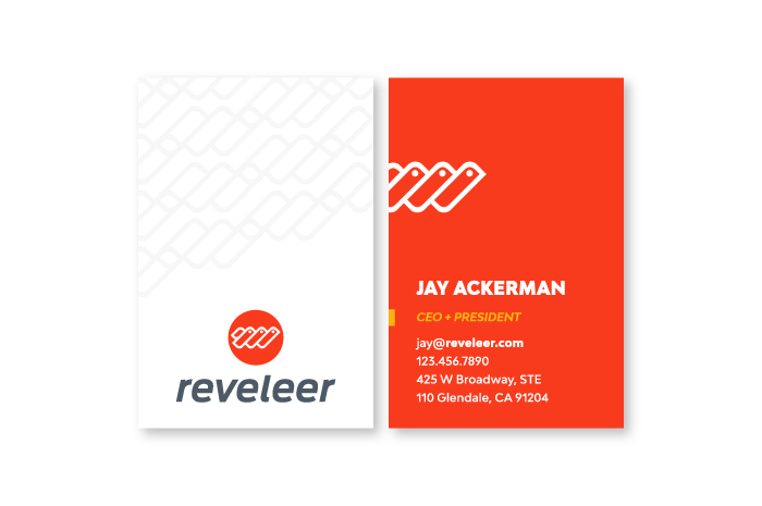
Having derived the name Reveleer, which talks to the brand's offering, we now sought to focus on the Brand DNA of 'community.' The identity was inspired by the sociable weaverbirds who fully embody the idea of community: The birds are protectors, creators and natural architects who build the world's largest compound community nests. This became a metaphor for the Reveleer platform and its communal drive. The three birds represent the brand's three core values: 1) think customer first, 2) make every moment matter and 3) foster community, while also signifying the connectivity (and, again, community) aspect of Reveleer. A lowercase font was chosen to represent the friendly personality of the brand, however, still coming off as a strong leader with the bold-colored icon choice. An italic typeface and forwards moving icon were designed to mimic the notion of acceleration behind Reveleer.I found it impressive that such great work could be done in the timeframe that we conducted it.
- Jay Ackerman
CEO