ANCHORY Brand Strategy
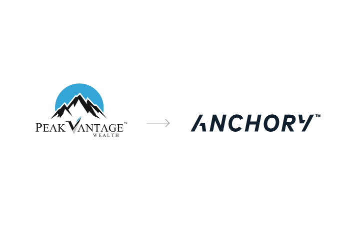
Texas-based Peak Vantage Wealth approached us for a re-branding, looking at the financial consultancy with a fresh set of eyes with the goal of creating a brand that will differentiate in a crowded field. Through an in-person Resonaid Brand Strategy session held in Austin, a new path towards a niche audience was derived. Given a selection of current customers and the founder's athletic background, affluent and active lifestyle US-based families were singled out, with much room to grow into professional sports.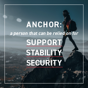
ANCHORY Naming
ANCHORY is a trust-invoking name that communicates the brand's mission well. The word anchor describes a person that can be relied on for support, stability, or security. Since ANCHORY leads with knowledge and guidance we leaned on the word advisory. The name ANCHORY, which was a readily available .com name, quickly became a brand name embodying what the consultancy provides: specialized financial guidance you can depend on.
ANCHORY Identity
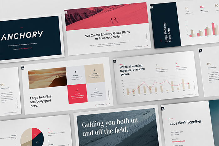
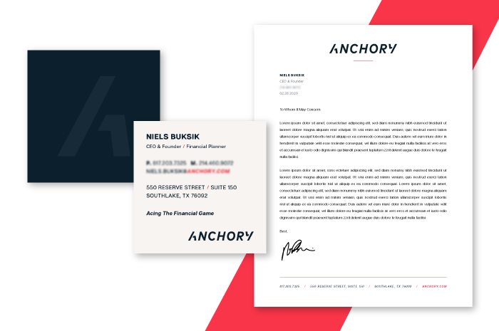
The brand identity design for ANCHORY is simple yet powerful. A custom italic typeface was created to showcase forward movement and speed: a nod to the acceleration of your finances, the athletic nature of its clients, and the consultancy's future-forward mindset. The letterforms A & Y are the exact same shape, flipped to tell the story of 360° financial advice from beginning to end. A deep navy blue was chosen for its symbolism of importance, confidence, power, and authority, as well as intelligence, stability and unity.When the final brand strategy was presented to us, we could not believe how incredible the final product looked.
- Niels Buksik
CEO & Founder