DUSKON Brand Strategy
A team of industry veterans approached us to launch an integrated LED outdoor fixture company. Brand was important from the get-go and through the Resonaid intensive we identified the need to own 'outdoor' in the B2B lighting space while crafting a very approachable and stand-out B2C brand positioning that has 'striving for efficiency' at its heart. We walked a fine line between standing out on the shelves and fitting in amongst the shelves of the few chains DUSKON needed to win over to gain the traction necessary to become a big player in the industry. With a solid brand foundation and culture road map in tow, we moved on to craft the overarching brand identity for the startup.
DUSKON Naming
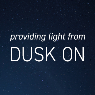
We were tasked with creating a name that had to be snappy, easy to say, spell and recall, yet, given the hardware space, it also needed to have a robust, industrial feel to it. Being an outdoor-only brand, we set out to showcase the timeframe in which their products shine: from 'dusk on' – and so the brand name was born. Sounding industrial at first, once the meaning is revealed in the minds of the consumer, it turns into an approachable brand in an instant; exactly what the client envisioned based on the brand strategy.
DUSKON Identity
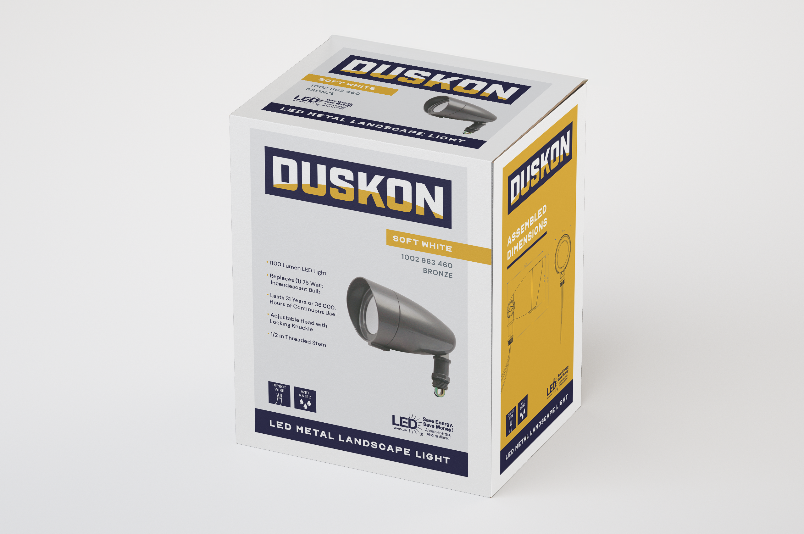
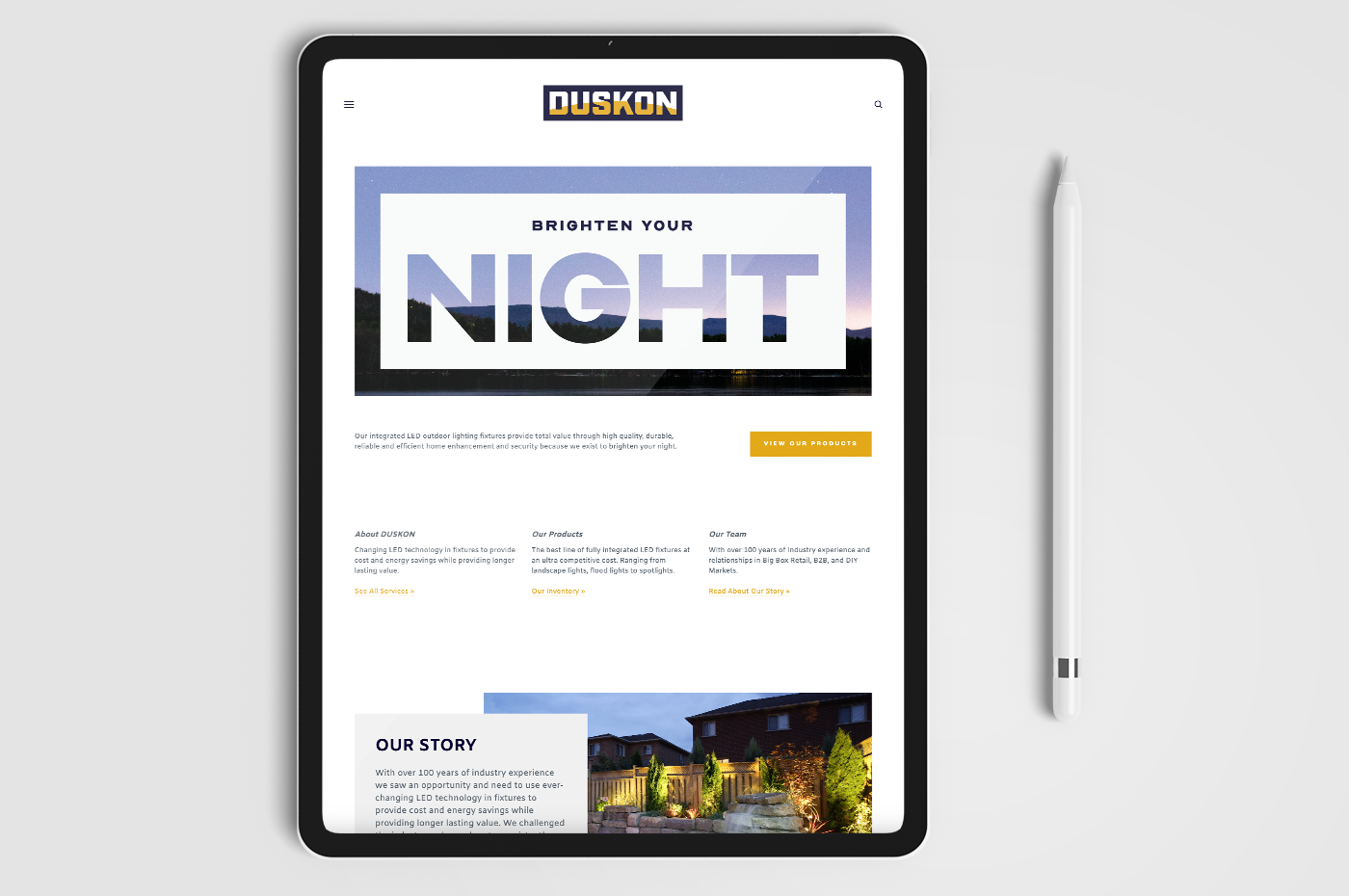
The DUSKON identity was created with smart simplicity at its core. A strong industrial typeface represents the reliability and durability of the lighting products. A deep purple was chosen over black to show the brand's personality of friend (and mother). The yellow arch within the typeface represents the setting sun to showcase the time within which the products are best used – from dusk on – while also celebrating the name. The visual treatment further strengthens the brand's core reason for being, and its tagline: to brighten your night.