WorldRemit Brand Strategy
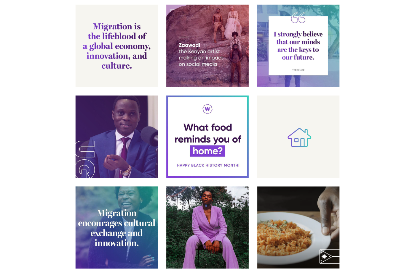
When London-based WorldRemit approached us, we were faced with a weak brand story and a non-distinct visual language in an increasingly competitive market. We started this fast-paced brand transformation project with our Resonaid workshop which we conducted with the C-Suite. A strong founding story was identified and we readied the team to lean into the emotional triggers of fairness and connection between people rather than the product- and feature-focused storytelling from the past: WorldRemit exists to connect people and their money across borders through delightful experiences because we believe fair financial exchanges create opportunities and strengthen human bonds.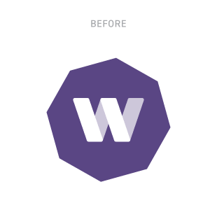
WorldRemit Brand Identity
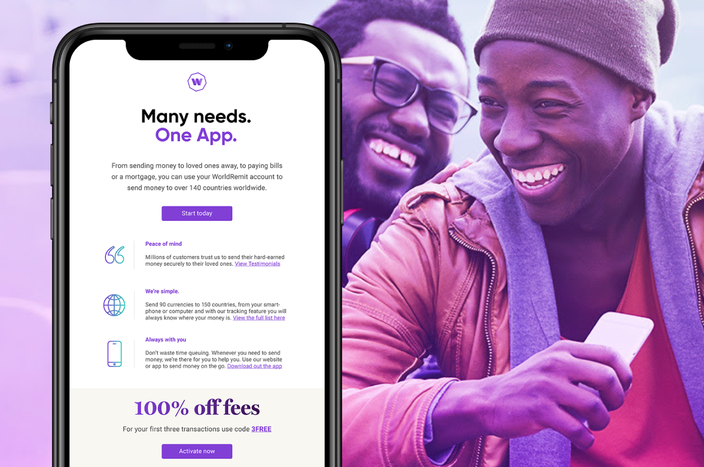
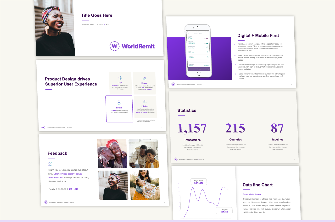
Next, we refreshed the iconic logo to be friendlier, younger, and more versatile in applications while rethinking the story behind the mark: The WorldRemit icon consists of an octagon which represents a world connected through technology, while the intertwined W highlights the relationship between the sender and receiver and WorldRemit and its customers. A full brand refresh that encompassed social media strategy and digital property re-designs followed.We tested the new visual brand and proposition and are overwhelmed by the positive response. Visual favorability increased by 60%, recall of brand story by 30%.
- Uwe Hook
CMO