Your Brand Launch: Identity
Brand Colors – Not A Science Nor An Art, But A Strategy
Life is full of give and take, and so at times one finds himself partaking in experiences that one would usually not seek out on their own. My lovely wife convinced me to partake in one such experience last week. We visited the ‘guru of aura photography’ as she made a rare L.A. stop – in form of a popup inside a hip retail shop – and had our pictures taken. Yes, there is such a thing, and it’s apparently currently not just a thing, but the thing. Gwyneth Paltrow does it, need I say more? And now, so have I.
Please, go ahead, meet my aura:
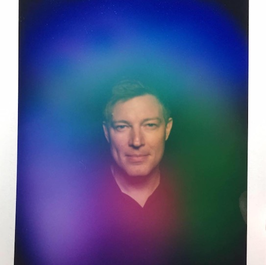
As it goes more often than not when opening yourself up to new experiences, this actually was quite enriching. It was fun to partake in a mythical-visual experiment of sorts, and my aura seems to be in good shape too; can’t you tell? Well, perhaps you can, at least a little bit. As for me, without the detailed info (or shall I say ‘reading’) I received after the picture was taken, I only knew that blue/purple was about trust and loyalty, and comparing it to the many other aura portraits I looked at online, prior to receiving the professional insights, I realized that it had quite a personality of its own. Everything else that I learned about the meaning of these particular colors and their locations surrounding my image directly from the photographer, I would have never guessed by just looking at the colors without a full de-briefing.
That experience also quite nicely summed up my rule of thumb when it comes to the art and science of using colors in branding:
Many books have been written about how to use colors in logos, the meaning of colors and how colors make consumers feel. I even dedicated 3 pages of my book on branding to the significance of color. Color makes an impression and it matters, absolutely, but just how much should the deeper meaning of color, that us ‘branders’ know about, really influence you and your creative team when crafting your brand’s identity?
My advice to you: Don’t read too much into the meaning of colors. It’s less a science and an art than it is a strategy.
Just because blue stands for trust, your FinTech startup should not choose blue for its logo. Your restaurant franchise should not immediately pick yellow or orange as the key color ingredient because it evokes appetite. If you go by the book of colors, you will never stand out from your direct competitors as they read that very same book. As far as my book of branding is concerned, it’s all about you not blending in, and that includes the color choices you make.
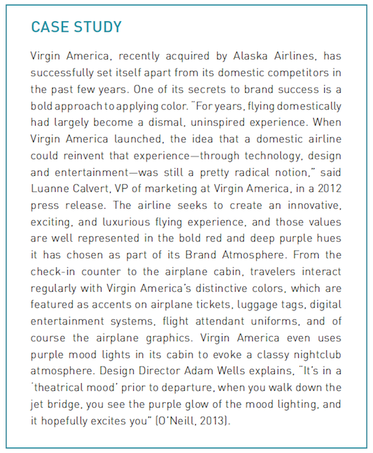
To celebrate Virgin America in light of the recent sad news, here is how they used color to stand out, via a case study from “How to Launch a Brand:”
Yes, colors matter, especially when you use them to stand out.
As you start researching the meaning of colors, stop. Instead spend ample time researching your competitor’s colors, then go the complete opposite route and pick colors that truly stand out within your vertical.
But, as most things in life go, this too is a give and take, so ensure the colors you and your creative team pick, as different as they may be from your competitors, will still support your brand’s personality and positioning. That may have been obvious, then again, so was my aura.
How To Launch A Brand: Lose The Ego, Gain A Soul
This interview with Fabian Geyrhalter, Principal of FINIEN, was originally published in The Huffington Post 07/15/16.
Chances are, if you’re a startup or a small business, at some point you’ve asked yourself: “How do I effectively launch my brand?”
While there are quite literally hundreds if not thousands of ways to get the word out these days, the truth is, unless you have a solid foundation from which to launch, your company could very well end up face-down on the pavement. In other words, if your brand lacks the necessary qualities to attract and retain loyal customers you may need to rethink your strategy.
As someone who constantly thinks about these things, I thought it would be fun to sit down with my friend and branding-savant, Fabian Geyrhalter, Founder and Principal of FINIEN. His Los Angeles-based consultancy specializes in turning ventures into booming brands. I’ve had a front row seat to his genius over the last few years, and watched brands he’s advised go from “zero to hero” in a very short period of time. Some have become market leaders, while others have sold to huge companies. Although his branding prowess wasn’t the only factor in these successes, I have no doubt it played an important role.
So whether you’re looking to refresh a brand you dreamt up three years ago or are starting from scratch without a website your business can call home, listen closely to what Fabian G. has to say. Here, I pick his brain on all things branding, positioning, and what you need to be successful in today’s digital world.
P.S. – He recently released the second edition of “How to Launch a Brand”, a step-by-step guide to crafting a brand, from positioning to naming and brand identity. It’s, pretty much, a must-read for anyone developing their own brand (which is basically everyone when you think about it, given how personal branding plays into individual’s professional careers today).
Rebekah Iliff: How many startup brands/companies have you worked with over the last several years?
Fabian Geyrhalter: In the last 3 years perhaps 50, in different capacities. The diversity in the brands we help launch is really what gets me up in the morning and why I dedicate my professional life to doing what I am doing. We helped craft a croatian underwear brand, a workers comp insurance disruptor, a VR brand, a winery, and then of course the expected fair share of apps.
What is most exciting is getting our heads into the minds of these highly diverse consumers and users and diving into the soul of these brands and connecting the two. Most founders are too close to their product, they built a tall wall between themselves and their product and the other side, the one that is so important, the consumer. It is usually mainly psychological – they have not moved an inch from their screens, so they are a bit disconnected from the ones using the product. I talked to a tech startup that worked on a product for moms and their toddlers. I asked them how much time they spent having coffee with moms or playing with toddlers. I received a deer in the headlights stare back. It was awkward; mainly for them.
RI: Why is it important for companies to think of their brands as having a Soul?
FG: A product that competes on price and features alone can never become a brand. A company that has soul does not need to compete on price; ever. Soul is what connects a product or service to a human’s emotion; a soul searches for a soul. We buy Patagonia and TOMS for a reason, and it’s not because of their product.
RI: What other brands do you think have a soul and why?
FG: Yes, there are the Patagonias and TOMS, but there are many startup brands that do it very well also. One I love to cite is Shinola. Born out of necessity and belief, the brand is fueled by authenticity and it found a great voice for itself that directly sparks emotion with their audience. I just spent $280 on a Shinola wallet last week. I did not think once of cross-comparison shopping. It just felt right. It was an all-brand purchase, solely emotional.
When that happens with a very young brand, then you know someone’s done their homework upfront when crafting a brand.
Another example would be Topgolf who realized that if they focus deeply on the target audience they would find the holy grail to generate revenue as a golf startup in a landscape where golf is known to be on the way out, not being able to connect with millennials. Topgolf created spaces to hang out, guys have craft beer and watch the games, ladies can wear high heels and sip cosmos, and everyone can enjoy instagram-happy lighting – and golf is something that happens in the background. They must have looked at bowling and realized that it’s a perfect recipe to get kids to start liking an ‘old’ sport again. It’s about them – and about socializing, in a way that works particularly well for that new audience. That is soul: soul searching in order for souls to connect.
RI: There has been a shift to brands focusing on “Purpose.” What’s the easiest way to incorporate Purpose into your brand, even if you’re a young company?
FG: The easiest way is to look at what your brand stands for, what is the WHY behind your brand: Why does it matter to have this product in this world at this point in time and for the long term and why will your audience deeply care? There is an intersection that will point towards a social cause that can be utilized in an authentic way to manifest that the purpose of the product/service goes deeper than generating sales. That is the easiest way since you asked for that; one that over the past 5 years has become somewhat of a staple for startups founded by millennials as ‘purpose’ is already ingrained in their thinking: “We don’t work for money alone, money is a necessity but not the reason why we are going into the workforce.” Multiply that by ten when they start a business on their own where the sky’s the limit, and the true north is up to their imagination.
In times of great political fear and danger, this generation of entrepreneurs is a shining star on the horizon, and I am grateful to be able to spend my days working with inspired, soulful people like that.
RI: In your book, you talk about Brands that have successfully made people an important part of their strategy. What is the advantage of doing this, over simply having a brand like Coca-Cola without a person attached to it.
FG: It’s a very strategic move that I discuss in my initial workshop with founders: How far do you want to, need to, or should you be the brand as a person? There is a clear danger to have a person be too closely tied to a brand, as was the case with American Apparel when things go sour, or it could simply hinder a smooth exit strategy. Most often founders are deeply tied with their brands.
The extreme is a Richard Branson, but on the other side of the spectrum you have a John Mackey (of Whole Foods), who only people in the business community know, despite him being the brand as a person. Ultimately, you can be the brand as a person in different ways. Many of my clients have several people that speak on behalf of the company. One faces the public as the creative force, the other as the business force, etc.
Rule of thumb is don’t name your business after yourself and don’t promote yourself more than your product, unless you are a consultant and you defacto are your business.
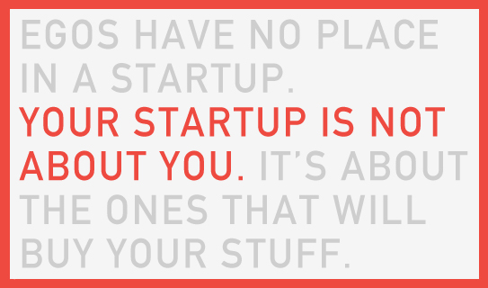
Even when I talked to a young and rising fashion designer I advised her to steer away from using her name and amplifying her image as part of the brand, even though we all know she is the sole designer. More often than not it causes brand turmoil down the line and is sparked mainly by ego, and believe it or not, egos have no place in a startup. Your startup is not about you, it’s about them – the ones that will buy your stuff. Think of them, think like them, don’t think about yourself.
RI: Why do you think so many early stage companies skip the Brand aspect of the process?
FG: One part lack of knowledge and understanding, one part negligence. Shake it in a speed-to-market way and top it off with self-funding and you have the Anti-Branding cocktail. It has a bitter after taste, guaranteed.
And this really is the reason why I wrote “How to Launch a Brand”. I wanted to create awareness and provide a step-by-step process. Affordability is not money alone, it’s also time. They can take an hour and a half and read the book and be aware and educated, or take a day and work through the workbook edition and get a lot of the important brand thinking done themselves. Some things they can do for themselves, some things (like creating the logo) they should leave to professionals, but even if they just listen to the 2.5 hours of the audiobook, at least they have a great understanding of the process and of the issues that can occur, steps not to miss and what to do at what time in the process.
I tell tech startups that branding is the first feature to which their audience will ever be exposed. That usually is a wake-up call.
RI: What do you think is a fair investment in terms of what an early-stage company should be spending on branding? For a resource-constrained startup, what makes sense?
FG: Early stage is such a loose term in this soon-to-come-bubble, but if they are working on a startup that they know they will invest a few years into and they will launch in a serious manner, they have to put aside a marketing budget and 40k should be the minimum to be allocated to crafting a meaningful brand strategy, name, voice and overall identity. For bootstrapped startups it can now be cut to $34.95 for the workbook I just released. Wink wink.
RI: Can you measure the ROI of a well-developed Brand?
FG: If six months after launch you have loyal followers, you have a tribe that posts for you in social media, that wears your pins and sports your logo, then you can definitely say that the investment into branding was well worth it. If you land a major investment because of the story and the professional deck and the amazing design from the inside (app/product) out (logo/site), then you should allocate a fair share to branding as well.
If your brand goes viral six days after launch because your name offends an entire country, people talk more about how weird your logo is than about your actual offering and if the few people within your target group, whom you force to look at your site don’t get what you do and why they should connect to it at all, then you most likely should point a finger (a specific finger) towards the brand folks.
Does Your Innovative Brand Look…Innovative?
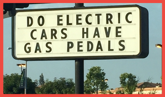
I see this sign every time I drive to my gym (I leave it up to you to guess how often that is, but let’s say it’s not as frequent as it should be). A tire company put it up and it always makes me smile and think about how wonderful of an industry I am working in; being able to collaborate with innovators, playing a part in what’s next, shaping the future one brand at a time. That sign also shows how, as an invention, the electric car category had to re-invent everything, including the industry terminology. (Electric cars do not have gas pedals, they have accelerator pedals).
And this brings me to my point: If you are starting an inventive, innovative – or may I even use the term – disruptive brand, does your visual (or verbal) identifier indicate that? Is your brand identity in line with your product or service, or is it falling right smack into the ‘Silicon Valley Crap Trap?’ What is that you ask?
Let me visualize it for you:
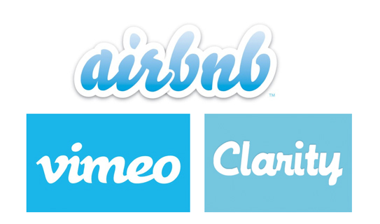
Now that is the Silicon Valley Crap Trap (pictured a few years back, a more modern take can be seen here).
All of these companies were innovative tech startups, all were real disruptors (yes, even vimeo). They worked hard to kick the status quo in its behind with their products, yet why did they all look the same, in that same crappy and uninspired way? Lack of money? Lack of inspiration? Lack of design skills? None make a good excuse given these are driven and highly talented entrepreneurs with a big vision. The answer of course is their determined focus on product (and product alone) that leaves all else, including the first thing people will see – the branding, crumbling in the dust.
Think about it (and this is where you come in): You are here to change things, to propel things forward. Shouldn’t your brand identity ache to stand out from the ‘competitors’, the landscape, the segment – just the way your product/service does? You can tell most of below brands from the unique shapes mixed with the specific color of their logos alone. Now picture a blue script font and ask: Which early tech startup comes to mind? Tough call…maybe Skype? Twitter? Any of the pictured above?
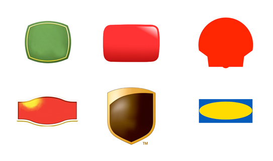
(You got it, but just to confirm, pictured from top left: John Deere, YouTube, Shell, Lipton, UPS, IKEA)
So let’s recap:
Your disruptive FinTech brand can not have a bank logo. Makes sense.
Your unique coffee bean brand can not have a hip coffee shop logo. Yup, we’d agree.
Your innovative…and on it goes – you get the point: Don’t fall into the trap and have your logo do what everyone else in your industry is doing unless your brand is doing exactly what everyone else in your industry is doing, in which case I digress and leave you to climb a mountain and ponder the bigger issues.
The ‘Concierge For The Masses’ Movement And Your Logo: 3 Ways To Partake Instead Of Being Left Unnoticed
Taking an Uber to my meeting I decide to stop on the way for coffee. 5 minutes ahead I use the Starbucks app to place my order. The app knows what I like, so creating my ‘warm’ double-tall-nonfat cappuccino with extra foam is a matter of one single tap. Rinse will swing by tonight to pick up my dry-cleaning for the week. By that time my living room furniture from Greycork should have arrived. All of it. I will assemble it without tools in 4 minutes, just before the dinner ingredients arrive at my door step. It’ll take me 10 minutes to make my farm-to-table dinner with Gobble tonight. My wife will be impressed.
![]()
Welcome to today. Slowly we adapt to a new way of doing things, and rather quickly are we getting used to it. Automation is the norm. Tech startups introduced us to what I dub ‘concierge service for the masses’. What used to be a luxury, is now expected. What used to be ‘disruption’, is now advancement.
Today we have very long brand memories of very short brand experiences. Those experiences are being supported by the icon we tapped, the actions we took, and the visual brand language that supported us along the way. Todays’ brands are built on the interaction of experience and flawless design. The first touchpoint more than ever is the logo/icon, which in many cases you simply tap to start your journey with a brand.
How much brand design remains with us after our experience? How much does a logo matter when we swiftly tap and move on? Here are 3 tips that will assist you when contemplating your next logo design, or current logo re-design, while keeping today’s consumer behavior up front and center:
1. You Have 8 Seconds To Communicate
Brand identities in today’s age need to focus on, and re-iterate, the essential qualities of a product or service in the simplest way possible while conveying more than ever before. Us humans are becoming more visual. Our attention span has dropped to 8 seconds before getting distracted. Put the two together and your logo turns into a key asset when communicating your overall brand, because it is one brand element users can not opt out of. Oftentimes it presents the only way to opt in.
2. Your Icon Has Its Name For a Reason: It Demands To Be Iconic
Since no one reads the marketing copy that went through twenty iterations to finally make it onto your web site (no one, but you, and perhaps your team since you are paying them for it), it just ends up turning into an annoyance to many users. It’s a road block to get to the images or the video that describe what you are trying to say verbally, in a stimulating visual way. In this visual journey, the logo mark and associated logotype turn into the focal point that is being associated with the brand experience when it comes to apps, and that spills over into our behavioral patterns outside the ‘digital realm.’ The more iconic your mark and typography, the more it’ll differentiate and stick in people’s minds. Today more than ever before, this becomes a do or die for logo designs, or call it an app icon if you will.
3. Make Your Logo Smaller. Even Smaller.
While brand identity designs needed to function at small scale, because they had to be fed through a fax machine in black and white and still be recognizable (hold their shape), yet convey the same meaning as when they were shouting from a billboard, the rules have not changed. The roles have changed: We can now, for the most part, skip the black and white version of your logo design, but your logo will live in the tiniest of social media avatars as well as (quite often) the app store. So small is – still – beautiful; it has to be.
As the consumer comes to expect simplicity and swift completion of tasks in a straight up user interface, we need to look at the creation and usage of a product or service logo in a different way to further evoke and support this experience. With lifestyles changing dramatically, so does our interaction with brands. Now that ‘the concierge service’ movement is turning mainstream, expectations of your brand are changing.
Make your logo your support during this change: A trusted friend that will bend over backwards for you and your followers; it will adjust during stormy weather; it will talk to even the ones that will only give it one second of their time. Most importantly, it will always strive to form a meaningful connection with each and everyone of them. And then when you hit the pillow at night it will keep on working for you while your Fitbit will be busy calculating your sleep pattern.
CATEGORIES: Blog Your Brand Launch: Identity
How Subliminal And Hidden Design Messages Can Boost Brand Engagement
This article was first published via Mashable.
A handful of brands keep their loyal advocates excited and engaged by using hidden design language to tell the bigger stories in a highly visual, yet subliminal manner. And that is exactly why we are drawn to them: We seek to be “in-the-know.”
Secretive design language is widely used on web sites as “Easter eggs,” within products as hidden features, as hidden offerings by food providers (In’N’Out’s secret menu or Bible citations on the packaging, for example) and even on passports as security enhancements, like Norway’s next passport design.
Utilizing design secrets to share underlying themes is a powerful brand statement — one that helps gain buzz and keeps believers lining up for more.

Very much like the speakeasy that has no sign out front and is incredibly hard to find, we are attracted to brands that challenge us intellectually and hide elements from plain sight. Seeing and connecting them makes us feel special, and that is one wonderful feeling that a brand can trigger within their audience.
Here are two ways your brand can turn to the subliminal to get its audience engaged.
Opportunity 1: Let Your Brand Identity Speak Through Design
Brand identities, or simply ‘logos,’ are the most common place to find hidden messages and deeper meaning at the very top of the visual brand pyramid. The arrow between the letters ‘E’ and ‘x’ in the FedEx logotype is the go-to example for subliminal messaging in logotypes, but you can find them all around you.
As shown by Amazon’s “delivering a smile and products from A-Z” and Baskin-Robbins’ “31 flavors,” key messages are often hidden within a logo. Today’s clever tech startups that understand the power of brand story telling are right on their heels.
A brand’s identity needs to say many things, and graphic designers go beyond the obvious to achieve all, or at least most, of the objectives, having to pull out some visual tricks to fit them all in. Once the audience finds out about a hidden element in the brand identity, it feels more connected to the brand itself, as if it’s part of their secret.
We love sharing that secret with others. Today, we call that virality. Your logo alone can get people talking about the deeper meaning behind your brand.
Opportunity 2: Add Unexpected Layers to Your Brand Atmosphere
Your Brand Atmosphere is your visual foot print. It is what your audience sees when they get in touch with your brand image. It’s everything from your collateral and online presence to trade show booths and your email signature. Brand Atmosphere represents another opportunity to tap into the power of hidden design language.
When my brand consultancy was asked to create the visual image for Martian Ranch and Vineyard a few years ago, we were thrilled to learn that the name actually stemmed from the founding couple’s sons, Martin and Ian. Cleverly, they put the two words together to formulate a name for their next big offering, the winery Martian.
Given the name, the client’s directive from the get-go was to craft a Martian character to grace the wine labels and represent the Martian brand. My agency, however, did not love the thought of being greeted by a Martian, not with a $22-$35 bottle of biodynamic California wine and a brand that stands for much more than what the name implies.
Ensuring a happy ending, or a happy landing so to speak, we allowed the Martian to make its way into the brand’s design, but we restricted its appearances in a refined manner. When a consumer opens the bottle, for example, Martians are dancing around the cork, drinking in a festive manner.
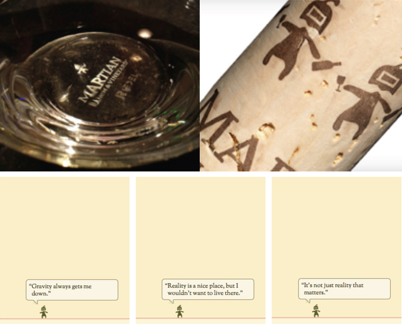
Then, when a site visitor goes to Martian’s landing page (no pun intended) for longer than 30 seconds, a tiny Martian character beams itself onto the site. It shares random thoughts like “Reality is a nice place, but I would not want to live there.” Needless to say, the Martian hunt was on and the buzz quickly spread, one glass at a time. All it took was one extra layer being subliminally added to the design language.
You need to dig deep into the core values of your brand. Is it humor, like Martian, or is it choice, like Baskin-Robbins? Incorporating hidden design language that speaks in unison with your brand values is useful and cost effective; you’re already going to pay to develop your brand’s identity and visual atmosphere.
Let the cleverness of your brand speak quietly, and you will hear the echo from your audience.
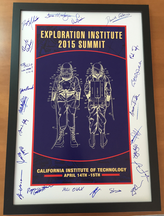
Marking New Frontiers
What can make one even more nervous when about to speak to a room full of acclaimed rocket scientists and astronauts (yes, they actually did the round-trip we are all dreaming of)?
Right when I was walking on stage the organizer interrupted to quickly introduce Paul Tompkins to the select group of participants as he joined the Exploration Institute Summit at Caltech a few hours late. His excuse? He was kept busy launching one of (Elon Musk‘s famed) SpaceX rockets in the morning. Yep, we all have our excuses, don’t we? This one felt rather legit and it made my entrance that much less significant and that much more nerve-wrecking as I was about to talk to a group of geniuses on the importance branding plays in the planning stages of their next explorations – explorations they were busy planning over the course of this 2-day summit. To the outside world I was standing tall, on the inside I felt very, very small. Telling myself ‘they’re just people like you and me’ did not do the usual trick to calm my nerves in front of this group.
As so often is the case in midst of an adrenaline rush, it ends up being a whole lot of fun. And may that be one of the few things that I had in common with the group of geniuses in the room of the Keck Institute for Space Studies that sunny April afternoon in Pasadena: We all get extreme personal and professional satisfaction out of uncovering possibilities, planning launches and exploring new frontiers.
Here is a short snippet of that speech (forgive the sound, it may or may not have been aliens listening in), which I felt like sharing as it relates to a new mission to space just as much as it does to your launch of a new company, service or product. And what week would be better suited than the week of 4th of July where many of us in the U.S. are busy launching our own, more approachable, versions of rockets into the sky.
3, 2, 1, 0, all engines running:
(click here if you can not view above video)
The ‘I am with genius’ trophy
5 Ways To Create A Timeless Brand
Creator, the beautiful online magazine of wework, the highly inspirational community of creators, published an original article by yours truly yesterday, so I thought sharing is caring. It goes something like this:
If I say “Coca-Cola,” you probably see the cursive typeface, red and white colors, curved bottles, and polar bears, right? That’s because Coca-Cola has spent decades building its brand with precise imagery, a consistent logo, and steadfast messaging.
While Coca-Cola is the quintessential timeless brand, many entrepreneurs have a tough time replicating its success because they’re drawn to the latest fads. Unfortunately, that’s not the key ingredient for enduring the test of time.
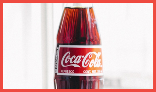
Photo credit: Lauren Kallen (Via Creator)
Styles change, but your company’s name and logo should not. You need to get it right from the beginning so you won’t confuse your target audience. It’s imperative that you create a brand that reflects your company’s values and is based on a shared passion with your target audience.
The brand that stays top of mind with consumers is the one that was built with “soul,” is driven by passion, and is marketed truthfully and consistently. A brand like Coca-Cola is truly timeless. Despite shifting marketing and advertising efforts, the brand is always surrounded by its unmistakable logotype and color scheme.
So how do you build a timeless brand? Here are five tips to get started:
- Buck the trends. If it’s in the moment, it’s unlikely to be in the future. Trends don’t hold up over time. People want something that stands out. A trend is cool for a very short time, then it quickly turns into an annoyance. The more honest and creative you are when crafting your brand identity, the more likely it is that you’ll create something timeless.
- Find a unique angle. If you try too hard to be like everyone else, you won’t be able to define your own unique brand identity. Look beyond your competitors, and dive deep into your own beliefs. Nail down what you’re about as a company, basing it on your core values, then determine how you want to communicate that to your target audience. Once you decide exactly what message you want to get across to your audience, you can create a truly unique visual and verbal brand language that’s lasting.
- Define your brand. A timeless brand has a shared passion with its audience. For example, Patagonia makes clothing for people who love climbing, skiing, and other outdoor sports that don’t require a motor. The brand caters to anyone who likes to connect with nature—hence it was able to expand from climbing gear to items for all other outdoor activities without losing its focus. This shared passion is directly reflected in the company’s sales because saving Mother Nature equals saving its audience’s playground.
- Be consistent. Your company name and logo are the first things that people will think about when your brand comes to mind, so keep them consistent. Make sure your logo is distinct, easy to adapt across different media types, and reflective of what your product or service actually delivers. (Hint: As you can learn from Zappos, it’s happiness, not shoes.)
- Avoid being too descriptive. When launching your brand, stay away from a name or logo design that’s too descriptive to avoid costly rebranding as your core focus shifts in the future. The uncertainty surrounding a rebranding effort could cost you time, money, and even loyal customers. At the very least, you’ll confuse them—as we recently saw with Airbnb’s rebrand PR nightmare.
When you solidify your brand from the start, you can focus on stabilizing it and investing in it. A brand that’s in unison with its identity remains relevant over time, and every party involved knows why the brand looks, walks, and talks a certain way. Base your brand on your unique offering, and connect with your audience meaningfully—you’ll be well on your way to developing a timeless brand.
Make Your New Brand Image Bland And Unmemorable
…was the advice I gave an entrepreneur last week. Wait, did I just really say this out loud? Yes, and here is why:
Like many entrepreneurs at the early (very early) stage, he was at a point where he needed to have a brand presence, just enough to get him through meetings looking legit. A business card in hand, a Powerpoint design to show and a web site to link back to. He was at a point where he needed to discuss his new venture in a professional manner with potential collaborators to further shape his concept. There was no outside investment and the core of the company strategy could sway depending on these initial meetings. It was not a time to invest in brand design, it would put the cart in front of the horse. So what to do?
There was no way for him to create the brand design the right way, so instead of applying any kind of distinct design language (making it memorable), he thought to make it “meh.” Make it bland, make it colorless.
I sincerely agreed. In this very rare case you actually do not want your brand image to stick in your customers minds.
People should be educated about what you do and who you are, but you should not create a memorable brand design and language around a very early stage concept if you know it will all change, very soon. Once the startup strategy is formulated, the brand can be shaped.
So go out there and have them call your number rather than recall your brand image.
4 Crucial Steps You Need To Take Before Crafting Your New Venture’s Logo
Don’t hire us to create your logo. Not us, nor anyone else therefor. Sure, we could create a great logo for you. It would look timeless, be very well designed (I believe we are one of the best, and many agree), it would work across platforms and for years to come, and everybody would be telling you how much they love it. So why shouldn’t you hire us to create this important piece of branding for you?
Chances are you don’t need a logo designed. Not yet.
Chances are you need a brand built, and your logo is just a part of it. By creating a logo in a vacuum, and out of sync, you will likely fail. I don’t want you to fail. Nor be part of failure. I think we share this belief as entrepreneurs.
It’s the cart before the horse idiom: Why put the horse in place if we don’t know the message by the messenger yet?
![]()
Below are 4 key elements you have to have in place prior to embarking on your logo design; they are the bare minimum requirements, the wheels of your cart so to speak:
1. You have a positioning statement in place that focuses on the ‘why’ and you stand tall behind it
2. You created 3 target audience personas that stand for who you are actually talking to/with
3. You know your brand personality and its associated keywords and are ready to act upon it
4. You have created a meaningful name that responds successfully to all of the above
If you don’t have these in place, creating a logo would be wasting your money, and (y)our time. It’s a lose-lose situation. How would any designer know what to design without these in place; how would the logo convey what it needed to convey; and finally, how could it connect with your audience? I don’t know, but I see it happen every day on the client’s expense.
Contact us if you need help getting there, as we love to assist and contribute, while speeding up that journey to your brand image.
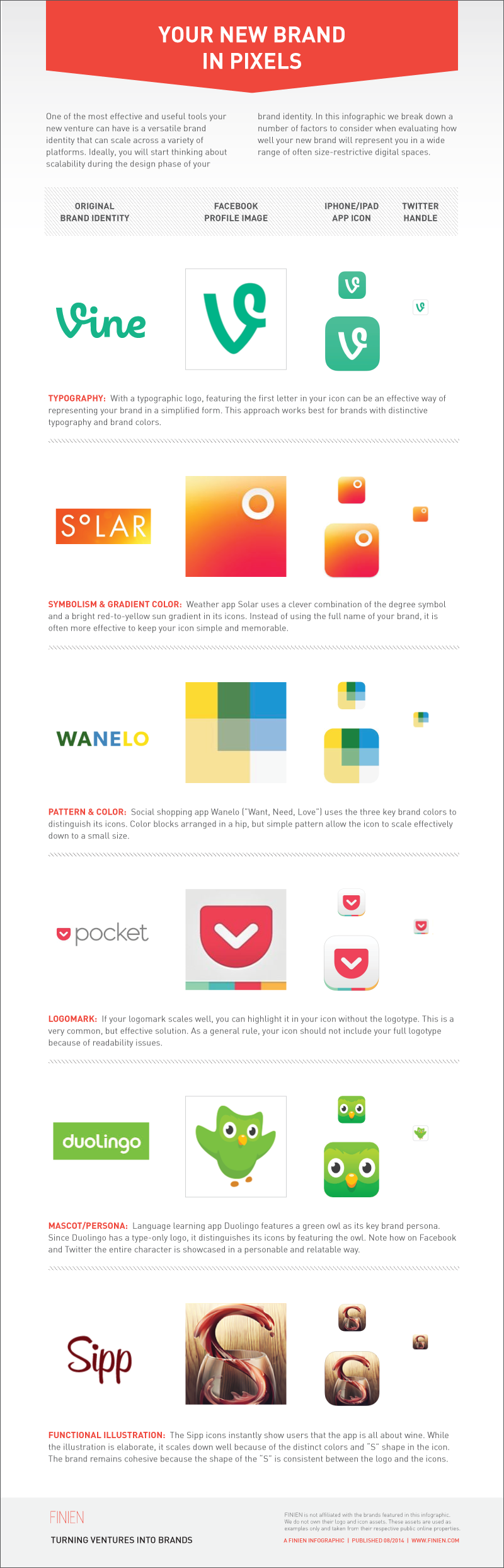
Infographic: Your New Brand In Pixels – 6 Ways To Scale Your Brand’s Identity
Click image to view full scale.
![]()
CATEGORIES: Your Brand Launch: Identity

The Post Host
Fabian Geyrhalter is the Principal of FINIEN, creating clarity for brand transformations.
JUST RELEASED
Key branding lessons to save time and money while winning hearts and minds.
CRITICALLY ACCLAIMED
How to turn any venture into an admired brand
THE #1 BESTSELLER
How to Launch a Brand