Center for Expanded Families Brand Strategy
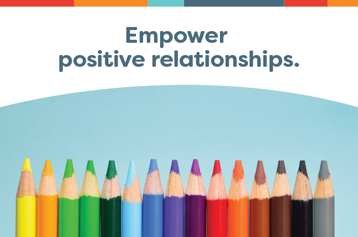
During the Resonaid Strategy Intensive we derived the friendly brand personality and strong core values while crafting a powerful story for CEF, a hub for key influencers in the lives of children affected by a change in parenting roles, that provides awareness, education, guidance and support to develop emotionally stable children. It does take a movement to craft the world's next generation.

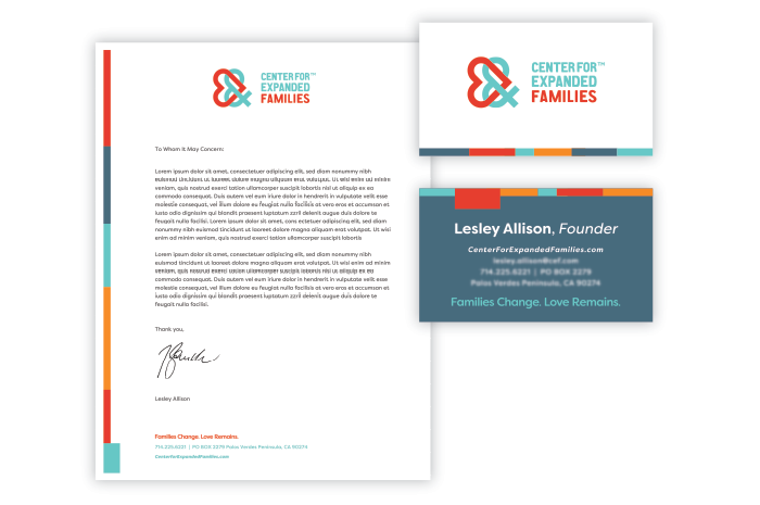
Center for Expanded Families Identity
The identity design signifies the key aspects of CEF: to create loving expanded families. The ampersand stands for the expanded family as well as for creating more love, more awareness, and support. The similar structure of the heart and the ampersand symbolize the essence of pulling out the love within expanded relationships. The heart is visually 'expanding' out of the ampersand. The two icons intertwine to represent the communication and collaboration CEF provides through our guidance. A bold, wide, rounded typeface was chosen for the name because of its friendly and approachable features, just like the service CEF provides.