Tag Archives: aura
Brand Colors – Not A Science Nor An Art, But A Strategy
Life is full of give and take, and so at times one finds himself partaking in experiences that one would usually not seek out on their own. My lovely wife convinced me to partake in one such experience last week. We visited the ‘guru of aura photography’ as she made a rare L.A. stop – in form of a popup inside a hip retail shop – and had our pictures taken. Yes, there is such a thing, and it’s apparently currently not just a thing, but the thing. Gwyneth Paltrow does it, need I say more? And now, so have I.
Please, go ahead, meet my aura:

As it goes more often than not when opening yourself up to new experiences, this actually was quite enriching. It was fun to partake in a mythical-visual experiment of sorts, and my aura seems to be in good shape too; can’t you tell? Well, perhaps you can, at least a little bit. As for me, without the detailed info (or shall I say ‘reading’) I received after the picture was taken, I only knew that blue/purple was about trust and loyalty, and comparing it to the many other aura portraits I looked at online, prior to receiving the professional insights, I realized that it had quite a personality of its own. Everything else that I learned about the meaning of these particular colors and their locations surrounding my image directly from the photographer, I would have never guessed by just looking at the colors without a full de-briefing.
That experience also quite nicely summed up my rule of thumb when it comes to the art and science of using colors in branding:
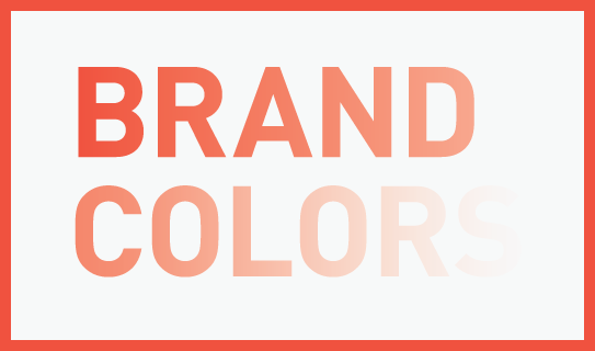
Many books have been written about how to use colors in logos, the meaning of colors and how colors make consumers feel. I even dedicated 3 pages of my book on branding to the significance of color. Color makes an impression and it matters, absolutely, but just how much should the deeper meaning of color, that us ‘branders’ know about, really influence you and your creative team when crafting your brand’s identity?
My advice to you: Don’t read too much into the meaning of colors. It’s less a science and an art than it is a strategy.
Just because blue stands for trust, your FinTech startup should not choose blue for its logo. Your restaurant franchise should not immediately pick yellow or orange as the key color ingredient because it evokes appetite. If you go by the book of colors, you will never stand out from your direct competitors as they read that very same book. As far as my book of branding is concerned, it’s all about you not blending in, and that includes the color choices you make.
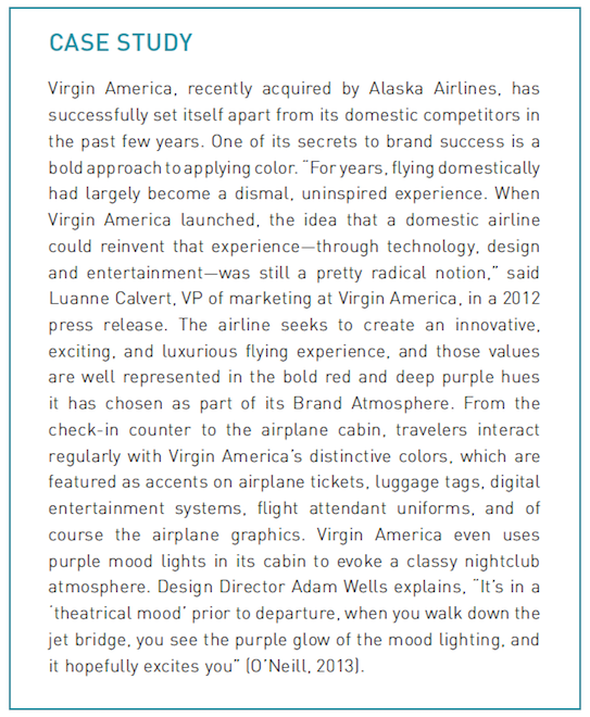
To celebrate Virgin America in light of the recent sad news, here is how they used color to stand out, via a case study from “How to Launch a Brand:”
Yes, colors matter, especially when you use them to stand out.
As you start researching the meaning of colors, stop. Instead spend ample time researching your competitor’s colors, then go the complete opposite route and pick colors that truly stand out within your vertical.
But, as most things in life go, this too is a give and take, so ensure the colors you and your creative team pick, as different as they may be from your competitors, will still support your brand’s personality and positioning. That may have been obvious, then again, so was my aura.

The Post Host
Fabian Geyrhalter is the Principal of FINIEN, creating clarity for brand transformations.

JUST RELEASED
Key branding lessons to save time and money while winning hearts and minds.

CRITICALLY ACCLAIMED
How to turn any venture into an admired brand

THE #1 BESTSELLER
How to Launch a Brand