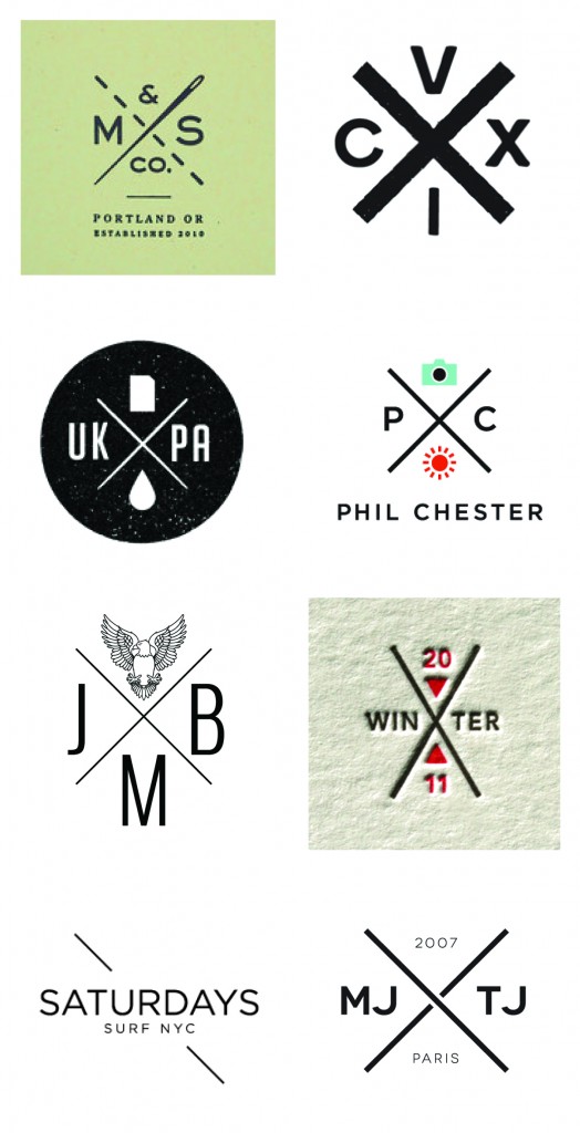
I was asked the question, ‘What current trends in logo design do you truly hate?’ at a panel discussion at NYU back in December. I felt it was time to manifest my strong feelings towards trends in logo design. It’s an oxymoron. A logo shall never be trendy. Trends come and go, your brand identity is created to stick around for a mighty long time, hence ruling out even the remote possibility of making it trendy.
Your logo can still be modern, exciting and speak to a young audience – it just can not look like a trend. How would you know? Your idea might have been derived from something you saw, maybe you liked it because it looked hip – maybe you’ve seen similar logos before and you felt yours should follow the lead. Don’t. Lead rather than follow. First with your logo, then with the rest of your brand.
Hip logos? X that idea out.[Click to Tweet]
I hope the very painful overly retro compilation below will make the point even more convincing. If it’s a trend, others will follow and you will end up blending in, and there’s nothing hip about blending in. It’s tough because you thought you finally had the chance to jump on the hip bandwagon. Your logo is not the right channel for that, but you can always use a one-off campaign to do something trendy with your brand instead.

Hipster Logos

CATEGORIES: Your Brand Launch: Brand Atmosphere Your Brand Launch: Identity
TAGS: Brand Atmosphere, Branding, Fad, Hip, Identity, Logo, Trends
7 COMMENTS
Pingback: 3 Crucial Brand Identity Mistakes You Can't Afford To Make | FINIEN
Brad Gurney
I agree. A brand should be timeless so it’s relevance outlasts every trend, so much good design slips through unnoticed because it’s been designed to last rather than to turn the heads of designers. Branding that has to last, should be designed to last!
Fabian Geyrhalter
Thank you Brad, well put!
Matthew Haeck
Good points – Plus I never really understood why clients would explicitly request their name to look like hundreds of others.
Just another example of a trend becoming a crutch. (and flat ui… I’m looking at you)
Pingback: What I know now // 010 - Jack Does Good - Visual communicator on a mission to do good well.
Alex EvolveRed
Amen to this article. That’s exactly what happened with Web 2.0 logo design, it came and went. The classics stay for centuries.
There are a few logo designers that ONLY specialize in retro logos, or only in this or that. While it’s smart to keep up with the “trends”, those designers will die out as soon as the trend does.
Pingback: Does Your Innovative Brand Look…Innovative? | FINIEN