
In case you were stuck in an all afternoon meeting, or took an afternoon off during yesterday’s WWDC 2013 announcement, Apple revealed its new Operating System design. Even if you are not an Apple Brand Advocate (anymore), your brand (launch) will be feeling the aftermath of the design language Apple just unleashed on millions of earthlings. Here is how I predict it will affect your brand design:
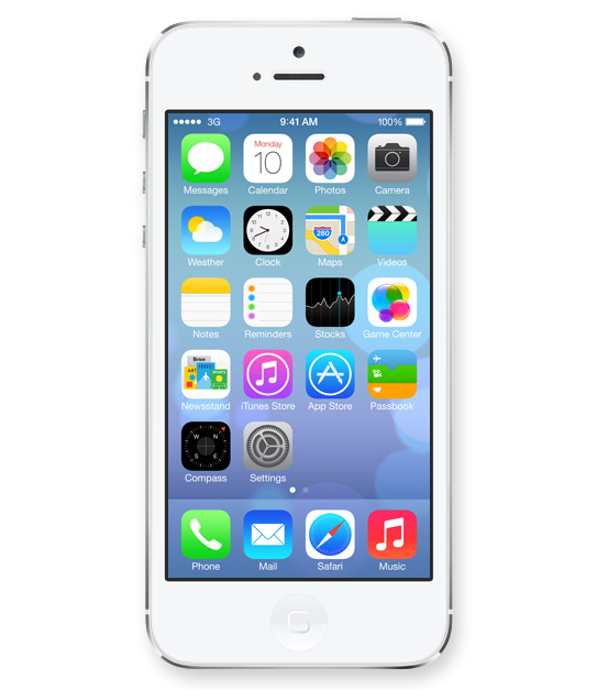
Icons lost their 3D look and this will finally spill back into the design of corporate identities. Days of pricey re-designs of Fortune 500 logos that basically added a 3D effect (AT&T, Capital One, Etc) are finally gone and simplicity in identity design will reign once again.
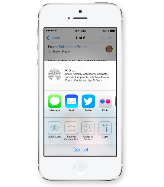
Apple’s use of transparency for navigational panels will trigger a move towards multiple translucent layers creating depth within digital interfaces. This would allow for multitasking and kill the traditional ‘top level navigation’ bar, allowing users to open multiple levels of navigational hierarchies based on transparency levels. Users will see the ‘page’ they are on while transparent layers will allow for unobtrusive ways of navigating down a couple of levels without ever leaving sight of your current ‘screen’.
Long gone are the days of black being the go-to color to convey luxury and sophistication. I predict layers of transparency quickly moving off screen and popping up across all media from print to on-air commercials, making white the predominant color (Is white a color you ask?) despite Pantone’s color predictions for 2014.
Images Courtesy Of Apple.
CATEGORIES: Blog Your Brand Launch: Brand Atmosphere Your Brand Launch: Digital Your Brand Launch: Identity
0 COMMENTS

Fabian Geyrhalter is the Principal of FINIEN, creating clarity for brand transformations.

Key branding lessons to save time and money while winning hearts and minds.

How to turn any venture into an admired brand
How to Launch a Brand