
For a consultancy that has a clear focus on brand creation, you might have wondered at some point why we did not create a stunning icon or a splashy in-your-face logo for our own company. Are we not following our own rules, are we lazy, or is there a different strategy at play? Ask no more, the myths will be busted today.
![]() I decided early on, even with my former company, Geyrhalter & Co, that designing a logo in its truest form for a business that is in the business of designing logos would not be the right path – it could only back fire. It might be too ornamental, too colorful, too round, too square, too bold, too…anything really that does not fit our prospects’ bill of decorative wishes and likes. We do not want to attract clients based on a graphic style, nor would we want to scare them away using a specific style. We are in the business of creating your brand, ours should remain in the background.
I decided early on, even with my former company, Geyrhalter & Co, that designing a logo in its truest form for a business that is in the business of designing logos would not be the right path – it could only back fire. It might be too ornamental, too colorful, too round, too square, too bold, too…anything really that does not fit our prospects’ bill of decorative wishes and likes. We do not want to attract clients based on a graphic style, nor would we want to scare them away using a specific style. We are in the business of creating your brand, ours should remain in the background.
In other words, it’s a bit like the design of a logo for an exclusive car seller that focuses on the newest and most luxurious models. He decides to have a visual representation of a Tesla turn into the logo. It represents a true cutting edge car while surely representing luxury. To him. And only today. A dumbed down comparison, I know, but you get the point. A brand identity design (through its 3 components) should describe what you are in business for, it should show your brand’s personality, touch on differentiators and your brand’s core values, but it does not need to, and most of the time should not show the actual product.
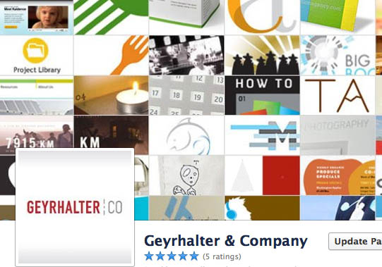
Our brand design needed to lead, it had to be professional and sophisticated, but simple, clean, and most important non-invasive. Below screenshot of my former brand agency’s Facebook page header shows how our simple logotype was floating above the work we did for our clients, making a clear statement of who was responsible for the brand visuals, yet distancing ourselves from all the colors and graphic shapes of our work.
When working on our brand identity design we took many paths before arriving at our current logo, which portrays innovation and disruption through sheer use of a bright and unusual poppy color, while the simple custom typography signifies openness and professionalism. When we launched FINIEN, it looked like an established company from day one, yet a disruptor with an open mind. It had fulfilled its purpose, matching strategic goals with final design. It has treated us well, even if it does not have a cool icon or splashy design, actually, because it does not have it.
CATEGORIES: Your Brand Launch: Identity
TAGS: Brand Launch, Branding, FINIEN, Geyrhalter & Company, Identity, Logo
1 COMMENT

Fabian Geyrhalter is the Principal of FINIEN, creating clarity for brand transformations.
Key branding lessons to save time and money while winning hearts and minds.
How to turn any venture into an admired brand
How to Launch a Brand
Lisa Reid
I was wondering about that when I stumbled onto this blog post. As I was reading, I realized that it was the branding that had attracted me to your site. It was more minimalist than the other sites I was looking at, which appealed to me.