Author Archives: Fabian Geyrhalter
3 Crucial Brand Identity Mistakes You Can’t Afford To Make

You call it logo. We call it brand identity. Just sounds so much more important. Why? Because it is darn important. It is the visual platform to all of your new brand’s communications. It is the visual foundation of the house you are about to build; the eye candy and sex appeal; the quick read ‘know it all’ brand identifier. Getting it right is an art. If I can give you only 3 pieces of advice before you dive head first into crafting this – did I say important? – piece of design with your agency or freelance design partner, these are the ones to keep up front and center on your dashboard throughout your journey: 1. You Want It To Be Everything You (will) have many ideas for how your new brand’s logo should look and what it should convey. I am here to tell you, sorry, you can’t fit them all into an identity design. You can try, but you will fail and you will suddenly find yourself not communicating anything at all. Your logo will look more like a painting of sorts and it will confuse rather than educate. Great identities convey one or two messages and they work because they do just that: They have a focus. They focus on the most important message through concept and visual target audience appeal through colors and typography. Ask yourself ‘What is the big idea and who should it cater to?’ A brand identity is a simple mark not a canvas. …
New Brand Adopter: Alex Osterwalder adopts Sifteo

Alex Osterwalder is the lead author of the global best seller Business Model Generation and inventor of the Business Model Canvas. Currently, working on Strategyzer.com, a strategy and innovation platform. Blogging at http://www.businessmodelalchemist.com Our burning question: Which recent brand launch do you admire? “I was pretty impressed by the launch of Sifteo Cubes. The online presentation, the packaging, and the product itself are great. I’m a big fan of the “unboxing experience” I got used to with Apple products. Sifteo provides the same for their cubes. The packaging is so beautiful, well designed, and practical that you can only love unpacking their product. So what about the product itself? My kids, the final users, simply love playing with the cubes.” FINIEN Weighs In We did not expect anything less inventive coming from Alex after hearing him deliver the keynote address at the Front End Innovation Symposium in Boston two weeks ago, Sifteo Cubes are just plain cool. “Sifteo Cubes are small computers that display graphics on their top surface and sense one another and how they are being moved….were developed as a platform for hands-on interactions with digital information and media (Wiki)” No surprise that they were derived by two MIT grads. OK, let’s talk brand. The Name We love names without preconceived notions. They eliminate domain name fights and they are ready to be branded by the sole marketing of themselves. Sifteo is easy to say, but it’s not the easiest to remember. For a kid, it’s not sticky, …
The top 5 must-do’s for your tech startup brand launch
Jason Calacanis, founder of Silicon Alley Reporter, Engadget, TechCrunch 50, LAUNCH, This Week in Startups as well as his new venture, Inside.com, asked me ‘What are the most important things you’ve learned about launching?‘ Here is what I wrote him: 1. PICK A PROCESS There are many processes to launching your tech startup. Choose one that works for your personality, budget and within the culture you are about to create. 2. TEST AND FAIL Test and fail and test and fail. You should invest in creating your brand only once you really understand your target audience’s behavior and true needs. 3. LAUNCH AS A BRAND Launch as a brand, not a startup that may develop into a brand. Launch by design. Design relates to the process you have to adhere to, but furthermore it truly is design that holds the key to early brand success. Graphic design, brand identity design, and web design will set your offering apart at the time of launch. 4. TAKE NAMING SERIOUSLY Naming is crucial. You can’t change the name of your kid once they are in puberty. The name you choose at launch will remain with the brand forever, so don’t settle for a placeholder name that just happened to make it into beta because the domain was available. It’s an art, science, and legal matter, so make sure it doesn’t get overlooked. 5. LISTEN SELECTIVELY ‘Opinions are like @**holes, everybody has one‘ – choose wisely whom you listen to, which opinions you implement, …
Chips Ahoy VS. Wholly Guacamole

Two punny names featuring a product mixed with a popular saying. “Ship ahoy” (old nautical shout-out) plus “chips” (as in chocolate chips, no relation with guacamole, salsa and such) equals “Chips Ahoy.” We just realized this is a pun ourselves – one of those things you see around all the time and suddenly you become aware of the concept behind the name. The term “Holy Guacamole!” is a slang term which basically means “OMG,” but you knew that. This brand of guacamole prides itself on not using preservatives and keeping the product 100% natural. There’s also a taco place here in sunny Santa Monica called ‘Holy Guacamole’ – but Wholly Guacamole is taking it up a notch on the pun barometer. Our first Punny Brand Name Showdown is a tough one to judge as both are quite clever and memorable, but OMG!, Wholly Guacamole takes home the whole enchilada based on the double layer of pun mixed with a product attribute. Chips Ahoy makes us aware of chips coming our way, which is a great thing, no question. But, Wholly Guacamole tells us that it’s, well ‘Holy guacamole!’ (not too specific, it may be great, it may be spicy…it may be all those things) as well as a natural product.
The Name-Letter Branding Phenomenon

Did you know that your name can have an impact on everything from your day-to-day decisions like which candy bar you prefer to some of your most important life decisions like the career you choose? “If a brand name shares our initials, we tend to like it more,” says Miguel Brendl, Professor of Marketing at the Kellogg School of Management, who has taken an interest in studying the complex relationship people have with their names and brands they purchase. It is no coincidence that there are an unusual number of Dentists named Dennis. Women named Louise are likely to move to Louisiana, and Craigs like Coke while Peters prefer Pepsi. Is it any coincidence then that I am running FINIEN and my name is Fabian? Read more about this interesting phenomenon here.
Your new brand’s logo cannot be hip
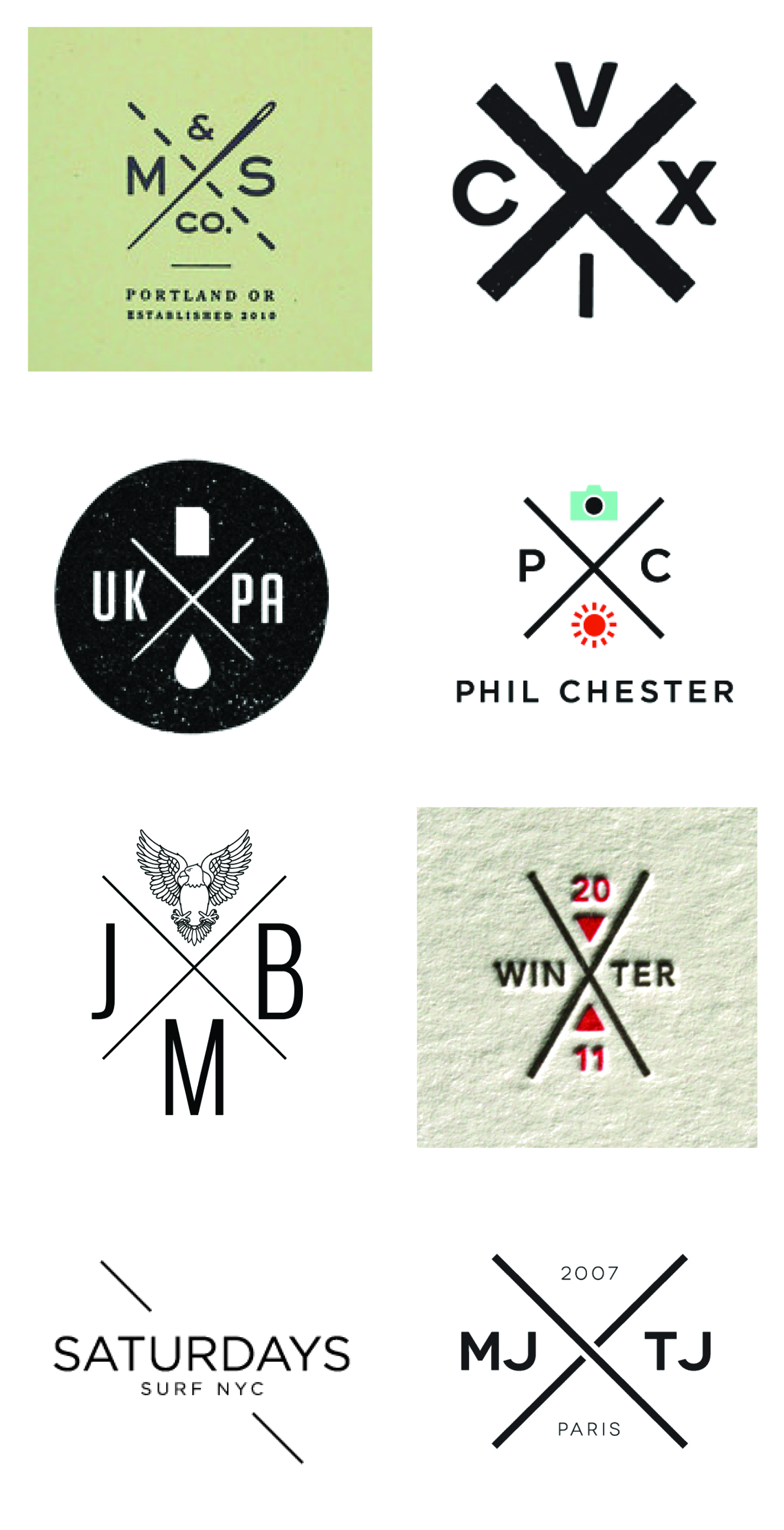
I was asked the question, ‘What current trends in logo design do you truly hate?’ at a panel discussion at NYU back in December. I felt it was time to manifest my strong feelings towards trends in logo design. It’s an oxymoron. A logo shall never be trendy. Trends come and go, your brand identity is created to stick around for a mighty long time, hence ruling out even the remote possibility of making it trendy. Your logo can still be modern, exciting and speak to a young audience – it just can not look like a trend. How would you know? Your idea might have been derived from something you saw, maybe you liked it because it looked hip – maybe you’ve seen similar logos before and you felt yours should follow the lead. Don’t. Lead rather than follow. First with your logo, then with the rest of your brand. Hip logos? X that idea out.[Click to Tweet] I hope the very painful overly retro compilation below will make the point even more convincing. If it’s a trend, others will follow and you will end up blending in, and there’s nothing hip about blending in. It’s tough because you thought you finally had the chance to jump on the hip bandwagon. Your logo is not the right channel for that, but you can always use a one-off campaign to do something trendy with your brand instead.
KISS 3 times during your next marketing effort
Creating a brand is only half the battle. Now you have to continuously keep building it. Over time, your brand requires carefully and well orchestrated crafting of one consumer message and marketing piece at a time. The truth is, this is where brands usually lose focus very early on. It’s time to KISS and make up. Our version of KISS (Keep it simple, stupid) is: Keep its soul, stupid! As I have declared the death of the style guide in an earlier post, now that the brand is on its own two feet, there needs to be a constant reminder of why your brand came into existence in the first place. It’s about your brand’s soul and with all the talk about metrics, ROI and the latest shiny marketing gadgets being rolled out in front of your eyes, one tends to forget the why and instead focuses on the what. The what can feel like the sexier, easier and, often times, safer choice. It is important to consider how a short-term campaign fulfills your brands’ values while also serving its long-term goals.[Click to Tweet] In a recent client meeting discussing creative round 1 of a website launch, the Marketing Team proudly shared our work for the first time with the CEO. She was delighted with the strategy and visuals, but having users go through a pop-over opt-in form prior to entering the site made her pause. ‘Whose decision was it to make the user go through this step prior to …
What’s in a Great Brand Name?

Benchmarks of a great name can be broken down into four distinct categories: 1) the name has significance and tells a story, 2) it has linguistic clarity and can be easily pronounced and spelled by the target audience, 3) the name is distinct and stands out amongst the competitors of your brand, and last but not least 4) it is marketable and has an available domain name. Refer to the below graphic where we explore the foundation of the Finien name.
Your New Brand Shall Live without a Style Guide
I proclaim the death of the style guide. For decades new brands have been equipped by their branding agencies with expensive and thorough style guides explaining how design elements, such as the logo, typography and brand colors shall and shall not be used. Most are obvious and none will be followed, so why continue with the tradition? Style guides are an important part of keeping your newly formed visual identity in check, one may argue, but does anyone care about using, or more importantly, reinforcing them? Over the past 11 years of running my branding agency I learned that it is more of a pricey exercise of ‘feel good’ and ‘make believe’ than an actionable tool. It will be presented to your employees in a big setting and over a period of 6 months it will be completely neglected. There is employee turnover mixed with new media adaptations and suddenly the lengthy and hard to navigate PDF is lost in some complex folder infrastructure and only gets found – and referenced – in order to point fingers, not to creatively implement. Looking at a very traditional brand manual from 1970 for the New York Transit Authority (of the great design legend Massimo Vignelli), one can appreciate the ideology and craftsmanship, and one might even buy into the need for it. It seems logical, after all you just spent a good chunk of your marketing budget on establishing the brand, or re-establishing an organization, but this is not 1970, this is …

The Post Host
Fabian Geyrhalter is the Principal of FINIEN, creating clarity for brand transformations.
JUST RELEASED
Key branding lessons to save time and money while winning hearts and minds.
CRITICALLY ACCLAIMED
How to turn any venture into an admired brand

THE #1 BESTSELLER
How to Launch a Brand