Tag Archives: Digital Design
Park Tahoe Inn
UI/UX for Lake Tahoe boutique hotel Park Tahoe Inn.
CATEGORIES:
Tackling Your New Brand’s About Page: 4 Tips On How To Say Less, Edit More, And Make It Resonate
I was born in Austria. English is my second language. Yes, I write a lot, but I do it because I want to share my expertise, not because I believe that I am a great writer. Yet today I set out to blur the lines of copy writing, branding, enthusiasm, content strategy, your target audience and content overload. Launching your brand puts an emphasis on the About section of your web site, no doubt about it. Even if you have a video and to-the-point messaging on the Landing Page(s), the About page will be sought-after. It needs to explain the following in a swift manner:
- What you do (Mission/Product Or Service Intro)
- Who you do it for (Target Audience)
- How you differ (Differentiators)
- Why I should care (Connect Emotionally/Value Proposition)
- What I should do next (Call To Action)
That’s a lot to convey on a single page and therein lies the problem for an enthusiastic entrepreneur who writes this important piece of content in a stream of consciousness (it is after all the subject you know best), then quickly proofs it, and by the push of a button publishes it. Rarely do they look back. Yet another item checked off the busy to-do list. Then the journey of marketing and metrics hits in and the About page, long forgotten, is like ‘a ghost employee’ in a well functioning company; it lives on yet it should have been let go and replaced a long time ago.
I know this feeling well. I see it on a nearly daily basis with our new clients, but I also fell victim to it myself. Here are my top 4 tips on how to go about deriving your About copy:
1. Find A Time And Place
It has to be right. You can’t just block off an hour on your busy calendar. It has to be more like that moment when you drive to the beach to just sit and breathe and think big thoughts. Make the time for that moment and don’t put a time limit on it. For myself that moment arrived during a 12 hour flight after I have answered ‘all’ E-Mails and there was no WI-FI for new ones to trickle in. I watched the Steve Jobs movie (Inspiration 1), had a glass of wine (Inspiration 2), the cabin lights went out so everyone could sleep (I was in Coach – Inspiration 3), and I knew if I started writing now that I had hours and hours to fine tune and contemplate. And so I did – the time and place were right. Best of all, even if I wanted to, I could not just push it live as I did not have WI-FI, so it forced me to sleep over it and make even more tiny edits when ‘back on the ground.’ It took me 3 hours to write.
Edit, edit, pause, then edit some more.
2. Think In Words, Not Sentences
Words should not come easy (Ask F.R. David, he knew). If they do, consider it a brainstorm exercise, then work on a synopsis of that copy. Don’t cut paragraphs, don’t review sentences, dive deeper and focus on it word-by-word. In the end your About copy should be thought of as a lineup of tag lines, because in a tag line every word counts, has meaning, adds to your brand story. Think of each word as a strategic component to the whole.
3. Read It Like They Would
Once you feel you phrased it in just the right way, make sure it will resonate with them. Sounds logical, hence easy, but it is one tough role play: Write in an emotional and enthusiastic manner that conveys your brand’s soul, but then read it from the perspective of your target audience. It helps when you created target personas, that way you can read pretending you are that specific person. If time allows, run it by your target audience and conduct a mini focus group, or even A/B testing of different About pages, to see what sticks.
4. Edit, Then Edit Again
Make it as simple as possible. Make it as short as possible. If you need to, add links to further content below your CTA (Call To Action). No one reads a long About section. No one. Rather go through steps 1-3 and then edit it down again and have something your audience will actually be compelled to read, because it is short and approachable. This is about getting them excited to keep going further, to click deeper, it is not the page that needs to convey everything, but ensure it has the 5 components listed above embodied.
In a study of user tests it was discovered that users with higher literacy levels also fared better on web sites written for a lower level literacy audience. So keep it brief and keep it simple. I guess I should go back and edit this post, but I don’t feel too bad keeping it this length as someone just released the book ‘Brief: Make a Bigger Impact by Saying Less;’ it spans 256 pages.
CATEGORIES: Startup Advice Your Brand Launch: Digital
New Brand Adopter: Steven Balaban Adopts The Samsung Galaxy Gear Smartwatch

Steven Balaban is the founder and CIO of Mink Capital. He has read over seventy business books in the last six years and has recently launched the site Best Business Books To Read to share his knowledge.
Our burning question: Which recent brand launch do you admire?
“I am fascinated by the launch of the Samsung Galaxy Gear Smartwatch. I first learned about the watch through a social media campaign that focused on a video that shows characters in TV shows, such as The Jetsons and Star Trek, using futuristic watches. The campaign claims that “The Next Big Thing is Here” and the video definitely gives that impression!
I remember the days when I was backpacking around Europe with my old camera and eight rolls of film. Now, I can travel with a 1.9 megapixel digital camera around my wrist. Am I really that old?”
Samsung Galaxy Gear- A Long Time Coming on Vimeo.
FINIEN Weighs In
Although launched only about 3 months ago, in the cell phone and gadget market, the Galaxy Note 3 is by now light years away from being a ‘new brand.’ Steven selected a truly innovative product, one I was curious about for a while and one that makes it hard to do our job; discussing the name, identity and digital brand atmosphere. We like to be challenged:
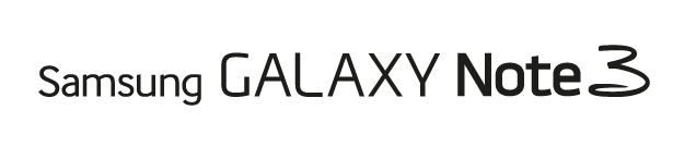
The Name
Cell phones fall into the category Fax and Copy machines once fell into. The inaugural product name (The iPhone, The Galaxy) sound sexy and/or inspirational, and at the time the iPhone 5c and the Galaxy Note 3 launch, they turn into fax machine names. More troublesome for Samsung though is the naming strategy behind the truly innovative part, the introduction of its Smartwatch. It has been degraded to ‘Gear’. Verbatim: The Samsung Galaxy Gear. Representing the only such ‘gear’ (there is only the watch), the choice is baffling to myself and confusing to the consumer, when all they want to call it is ‘the watch’.
FINIEN Brand Happiness Barometer: Name 2 (out of 10)
The Brand Identity Design
The name is the first step to defining a brand’s identity, and with a 4-part name the brand identity design is quite a train wreck that is as hard on the eyes as it is on your tongue. You won’t fall in love with the name, nor the logotype, so what to do? Throw in Robin Thicke, add a hashtag (#DesignYourLife) and let’s not bring up ‘Samsung Galaxy Note 3 + Gear’ too often. Nor the Jetsons, Thicke replaced you and Knight Rider as of now.
FINIEN Brand Happiness Barometer: Brand Identity Design 1 (out of 10)
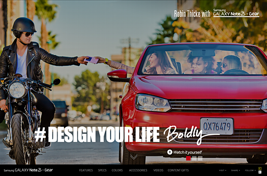
The Digital Design
Seems as though the majority of the budget was spent on the highly produced Robin Thicke commercials, hence they occupy the landing page in its entirety. A bold move, one that leaves the user ‘interacting’ with the brand and ‘exploring’ the site, but truthfully, it means that they are lost looking for details on what the SGN3+G (Forgive me for not spelling out the full name) can really do for them. We soon learn that the site itself has been overproduced as well, taking advantage of many bells and whistles of today’s web design yet leaving functionality and plain product info, features and calls to action behind. The web site is the number one informational source for gadgets, being so cumbersome to navigate, it leaves me thinking that the SGN3+G might offer the same clunky experience.
From a brand experience perspective I might leave the ‘gear’ behind and wait for a ‘smartwatch’ after all, as there will be many to chose from shortly. For now I, and perhaps Steven, will hold off on Robin Thicke and wait patiently to live the Jetsons’ life instead.
FINIEN Brand Happiness Barometer: Digital Design 3 (out of 10)
CATEGORIES: Your Brand Launch: Brand Atmosphere
Launching Brands Online in 2013: One Step Forward, Two Steps Back
I am sick. And it’s not the flu.
I am sick to my stomach looking at all those amazing new ideas from sharp entrepreneurs going up online. Ideas that are as varied as they could possibly be, all nurtured by a revolution in online fundraising and fueled by an economy that is looking for the next big thing. Many of those ideas I see are truly revolutionary, but it still makes me sick looking at them. They all seem identical and I can not differentiate one site experience from another.
The internet gave entrepreneurs the ability to use cheap, often free, templates and it happens that everybody chose the same ones. I can’t blame them, these are robust templates taking advantage of responsive web design, while being equipped with all the features necessary for most entrepreneurs this day and age. They look and feel modern and they represent what I’d call a MVW – A Minimum Viable Website.
One thing gets lost though, sometimes is even missing from the get-go: A big brand entrance through a unique visual language that differentiates the brand enough to stay in the audience’s minds.
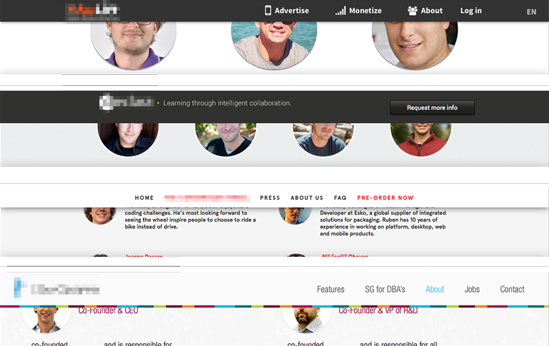
Above: Four startup sites I came across recently. Who is who? Which product is which? Wait, was that the site of that company I liked so much?
Conceptual and visual creativity used to be the integral ingredient of any brand introduction in the heyday of printed communications – they now are missing in action. To many of today’s entrepreneurs it is the product/service idea alone that counts, but sadly that idea gets lost without being embedded into a branded environment. The internet provides free tools; it does not mean that those fit into your company’s launch strategy. Leverage them when appropriate, avoid them when launching a brand. Consumers will get lost and your unique idea will look like a standard idea by using standard templates.
Be bold, be different, be conceptual. Go ahead and inject your enormous amount of creativity, strategy and moxie into your online presence, because it will be the place most people will meet your product/service first. And as far as I can tell it’s anything but standard.
CATEGORIES: Blog Your Brand Launch: Digital
The Importance of Branding At Time of Launch For Tech Startup, B2C/Retail And B2B Company Founders
‘Is branding the key for a successful start-up?‘ is the topic for a speech I was asked to give at Internet Hungary this week. I could make it a 5 second speech and say ‘Yes, it is one of the most important factors,’ but lucky for me the topic is broader and will go deeper into the keys of creating a successful brand. Let me use this opportunity though to dive knee deep into this question as some brand elements are more important to certain types of companies at time of launch than to others:
No one shall skip the Brand Platform creation at the onset of a new venture, unless you want to compete on price, be boring and unattractive to work for, and are not keen on acquiring the right target audience at time of launch. You tackle the Brand Platform right after you draft your business plan (from fully fleshed out to napkin version – all are acceptable forms of business plans at this stage, depending on your own comfort level).
Launching with a meaningful and unique Name and Brand Identity Design seems like a no-brainer, a must for all entrepreneurs. If for whatever logical reason (budget not being part of that logic) you feel forced to launch with a sub-par name and logo, knowing you will have to go through a (more costly) re-naming and re-branding exercise upon showing first successes, it is the easiest to do for a tech startup or B2B venture that requires solely test users or relies on a very small niche audience, which will make it easier to educate them on this big and disruptive brand change down the road. Some Tech Startups (especially apps) are prototyping until the day of launch, making it an easy excuse to skip this essential step, whereas it is much more advisable to work on a prototype whilst formulating the brand platform, that way you are educating yourself about the target audience while you see them use the actual product, enabling you to create a meaningful brand that will not have to be rebuild soon thereafter. A win – win.
Needs for Brand Atmosphere Touch Points vary in importance and specifics from company to company with retail and other mainly offline B2C companies leading the list, E-Commerce and Tech Startups surviving off some basic, consistent touch points bundled with heavy E-Marketing template creations, while most B2B brands fall anywhere in-between, depending on their structure and audience. If bootstrap is your motto, these can be rolled out over time, making it essentially more pricey, but allowing you to spread the cost.
It only makes sense that ventures leading with digital need to make UI/UX Design part of their strategic brand implementation. Most companies – B2C/Retail and B2B – rely heavily on brand-centric (responsive) web sites to attract and convert leads of different types. For Online Retailers and Tech Startups where the web site also is the product, the prototyping should be addressed in parallel with the Brand Platform creation as it will educate the branding process as a whole. Some companies are able to save on development costs using existing WordPress templates (and such), but brand will still be key at launch.
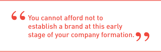
To conclude, whenever a startup founder tells me (and they tell me all the time) “I can not afford branding at this early stage of my company formation” I reply with “No, you cannot afford not to brand at this early stage of your company formation. Unless you think a strong brand is worth less at time of sale or IPO than an ugly yet functional prototype.‘ This often marks the end of our conversation, until they call a few weeks later to get started with branding their new venture.
Brand Identity For Hispanics in 2013: How Current Cultural Values Affect Your Brand Launch
Catering this post to those of you who target a new brand launch towards the Hispanic segment makes me aware that you will likely assume you know your niche audience. True that. But what I have deciphered for you are nuances and slight shifts in behavioral patterns based on Thinknow’s U.S. Hispanic Cultural Values 2013 study that, when applied to specific brand identity tasks, can make a big difference in your approach and the success of your next brand identity project launch.
Naming
Brand tonality is where you have to read between the lines when it comes to understanding the new Hispanic audience. If you craft a brand name for the 18-34 audience, be aware that they seek community with other Hispanics more than the above 35 group. Launching a brand for that group lends itself to creating a ‘spanglish’ name as the preferred language (especially amongst males) is English. The need for family unity and Hispanic community is also high on their list, so a Latin touch would go a long way for your brand name. Creating a name for male Hispanics (of all ages) can drift into English as they emphasize the aspiration of living the American dream and your new brand would piggy back on that aspirational connotation. With about 40% of surveyed Hispanics speaking primarily or only Spanish, a nod to both languages recognizes their multicultural experience and is the advised way to creating a new brand name for the Hispanic of 2013.
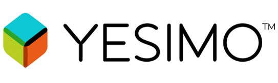
Above: Branding project we recently conducted for an American corporation offering (mainly) American brand products to the Latin American market. We derived the name ‘Yesimo’ and its correlating brand identity. Both serve as a good example of a name and identity that combine an American with a Latin feel in a warm yet sophisticated manner.
Identity Design
When designing a brand identity be sure to add one important keyword to your list of things you want to convey, pretty much regardless of your specific offering: Family Unity. The idea of familia is on the rise, especially with females and the under $30k income brackets. Combining warmth (warm colors, round sans serif typefaces and round shapes), with aspirations of the new, integrated and more monetary focused US based Hispanic (icons of growth and wealth, modern color hues and a corporate & trustworthy look) will resonate well across product and service offerings.
Digital User Interface and User Experience Design
Think usability times four. As simplicity in navigation design and content is on the rise in the US, you can ride that wave while simplifying your digital design even more so based on the added language barrier. Use infographics and icons to explain steps to take or sequential storytelling. Don’t be obvious when catering your content tonality towards Hispanics as it may conflict with the rise in a need to control their own destinies. Speak to the modern Hispanic in ways you would with any other US counterpart, otherwise you might not be heard at all. Integrate and maximize social sharing tools to enable an easy viral spread of your brand amongst friends and family (#1, 2 and 10 on the revised cultural values list of 2013!) and make sure your site is created in a responsive manner (accessible and scalable for all devices from desktop to iPad to smartphone). If you have the capabilities to create a bilingual site, offer the option of Español in a drop down.
As we see the US based Hispanic audience integrate exponentially, let’s not lose track of the nuances. As we all know, the devil lies in the details, so let’s get ready to create devilish smart and detailed brands!
Brandman University
Brandman University, established by Chapman University in 1958, is an innovative, student-focused, non-profit university, ranked “Best” by the U.S. News and World Report. However, the university’s existing website failed to communicate this message. The team at FINIEN joined forces with the development firm at Urban Insight to strategize, design, and develop a new responsive website that would provide current students with an improved information finding experience as well as attract prospective students.
CATEGORIES:
Martian Ranch & Vineyard
FINIEN worked on strategy and design on this marketing tool for Santa Ynez winery Martian Ranch & Vineyard’s inaugural biodynamic wine release. The app works as a visual tool that helps you easily track days for sowing, pruning, and harvesting a wide variety of crops. It has the added benefit of identifying “Fruit Days,” which are ideal days for tasting wines. The winery was able to attract new customers who are interested in biodynamic wines or simply want to know when to open that special vintage, while it enabled Martian to build its brand for its existing clientele in a sophisticated and useful manner.
To download the app, click here.
To view the biodynamic calendar online,
click here.
CATEGORIES:
Co-opportunity Natural Foods
UI/UX Design for Co-opportunity Natural Foods.
CATEGORIES:
Grossman Design and Construction, Inc.
UI/UX Design for Grossman Design and Construction, Inc.
CATEGORIES:

The Post Host
Fabian Geyrhalter is the Principal of FINIEN, creating clarity for brand transformations.
JUST RELEASED
Key branding lessons to save time and money while winning hearts and minds.
CRITICALLY ACCLAIMED
How to turn any venture into an admired brand
THE #1 BESTSELLER
How to Launch a Brand