
When I was 8 years old I started ‘a publishing house’. I named it Buttersemmelweich Verlag. A real memorable name, right? It translates to ButterBreadSoft Publishing Co. It only published a single magazine, but over the course of several years. It was called SNOOPY. Go here for a stunning visual I dug out from the family archives just for you. Please note the Nike logos on Snoopy’s shoes, a sign of innocence lost and a hint of my future in branding. Perhaps the Charles M. Schulz Museum (which I can highly recommend a visit to) will sue me for the 6 issues I sold – yes, the young entrepreneur that I was I actually asked my family members to pay for my work. Just like a retainer, each issue I drew and wrote was copied 6 times (by my mum) and always sold out (to my mum Etc). As I grew a year older the name of the magazine was changed to JoeCool, an obvious transition, and I brought on ‘a partner’ as one ought to do, especially since I could not use the typewriter yet. My fascination with magazines grew over the years. As a young communication designer I felt the need to be on the forefront of pop culture, to be informed about as many topics as I possibly could in a swift and constant manner, while being surrounded by the freshest fonts and layouts. Since the internet has not quite been as giving back then as it is today, buying as many magazine subscriptions as possible was my goal. I have since adjusted my subscriptions, but have not kicked the habit. Needless to say, I have seen (and over the years also professionally designed) plenty of magazines.
As I descended into the current issue of Bloomberg Businessweek a couple of evenings ago, I was shocked before I could even flip to Page 2. The cover was bad. It was so bad that it was actually appalling to me. Judge for yourself:
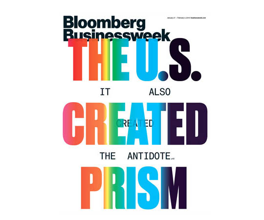 I was shocked, not a bit intrigued, only shocked, and a little sad as Bloomberg Businessweek has been pushing its design steadily after its acquisition in 2009. Conceptual, socially challenging and often shocking cover designs were part of their re-branding. But this cover is just shockingly bad.
How did it happen and why would you care?
Bloomberg Businessweek shares the story on how the covers were conceived in each issue, on Page 2, right next to the index, a prime location for any magazine. So here it goes:
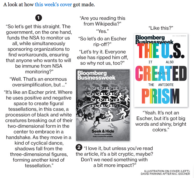
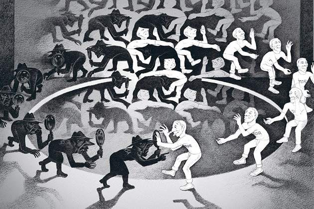
Image Source: Bloomberg Businessweek
Yes, indeed they talk about ripping off MC Escher – and may I add that the original design (above) also has a touch of Spy vs Spy ‘borrowing.’ Alright, I registered that as a bizarre strategy statement, but going from a solid conceptual and surely intriguing (yet copied) design to a horrendous – ‘at least it’s got big colorful letters’ – solution makes it obvious that the chosen design option only made it to the cover in a rush to meet print-deadlines (imagine how long the Escher illustration must have taken to create?).
As the reader, a consumer, the target audience, do you see the problem? Sharing both designs and the decision criteria is a very bad brand decision. If the cover design is genius, Bloomberg Businessweek’s story on how it was made is only killing the magic. No room left for imagination. Even worse, we can see how bad the other cover design option was, making the amazing design option that much less great as we want to feel designs go from good to better to great. If the design is really bad (as it is in the current issue) and the option that did not make it would have been significantly better (as was the case in the current issue), the reader is upset and disappointed by Bloomberg Businessweek’s choice. This is obviously not good for a brand and I see this as an open letter to Bloomberg Businessweek to change its strategy and to use this Page 2 real estate for something that works for, instead of against, its brand.
As an entrepreneur, never share your design options with your audience at large. It’s tempting as they are the ones that will need to buy (into) it. If you really don’t trust your brand or design consultants, have a small and narrow focus group, if you must, but do not share design options with your entire audience. Not during, and definitely not once they have been made. Most everyone who did not go through design college tends to screw this up big time. Look at Marissa Mayer’s big fail when introducing the public to Yahoo!’s logo re-design last year. Everyone got excited, everyone had their favorites, and then…a universally disappointing final choice.
The habit of sharing creative options is one of over sharing, or TMI as one would text. Don’t fall into this invitingly open trap as your audience’s TMI feeling would very quickly morph into an OMG and a WTF (Excuse my language) expression on your end. Spare yourself, and your brand that pain.
CATEGORIES: Startup Advice Your Brand Launch: Brand Atmosphere
TAGS: Bloomberg Businessweek, Brand Atmosphere, Branding, Cover Design, Creative Process, Decision Makers, Identity, Magazine Design
0 COMMENTS

Fabian Geyrhalter is the Principal of FINIEN, creating clarity for brand transformations.
Key branding lessons to save time and money while winning hearts and minds.
How to turn any venture into an admired brand

How to Launch a Brand