Your Brand Launch: Brand Atmosphere
How Subliminal And Hidden Design Messages Can Boost Brand Engagement
This article was first published via Mashable.
A handful of brands keep their loyal advocates excited and engaged by using hidden design language to tell the bigger stories in a highly visual, yet subliminal manner. And that is exactly why we are drawn to them: We seek to be “in-the-know.”
Secretive design language is widely used on web sites as “Easter eggs,” within products as hidden features, as hidden offerings by food providers (In’N’Out’s secret menu or Bible citations on the packaging, for example) and even on passports as security enhancements, like Norway’s next passport design.
Utilizing design secrets to share underlying themes is a powerful brand statement — one that helps gain buzz and keeps believers lining up for more.

Very much like the speakeasy that has no sign out front and is incredibly hard to find, we are attracted to brands that challenge us intellectually and hide elements from plain sight. Seeing and connecting them makes us feel special, and that is one wonderful feeling that a brand can trigger within their audience.
Here are two ways your brand can turn to the subliminal to get its audience engaged.
Opportunity 1: Let Your Brand Identity Speak Through Design
Brand identities, or simply ‘logos,’ are the most common place to find hidden messages and deeper meaning at the very top of the visual brand pyramid. The arrow between the letters ‘E’ and ‘x’ in the FedEx logotype is the go-to example for subliminal messaging in logotypes, but you can find them all around you.
As shown by Amazon’s “delivering a smile and products from A-Z” and Baskin-Robbins’ “31 flavors,” key messages are often hidden within a logo. Today’s clever tech startups that understand the power of brand story telling are right on their heels.
A brand’s identity needs to say many things, and graphic designers go beyond the obvious to achieve all, or at least most, of the objectives, having to pull out some visual tricks to fit them all in. Once the audience finds out about a hidden element in the brand identity, it feels more connected to the brand itself, as if it’s part of their secret.
We love sharing that secret with others. Today, we call that virality. Your logo alone can get people talking about the deeper meaning behind your brand.
Opportunity 2: Add Unexpected Layers to Your Brand Atmosphere
Your Brand Atmosphere is your visual foot print. It is what your audience sees when they get in touch with your brand image. It’s everything from your collateral and online presence to trade show booths and your email signature. Brand Atmosphere represents another opportunity to tap into the power of hidden design language.
When my brand consultancy was asked to create the visual image for Martian Ranch and Vineyard a few years ago, we were thrilled to learn that the name actually stemmed from the founding couple’s sons, Martin and Ian. Cleverly, they put the two words together to formulate a name for their next big offering, the winery Martian.
Given the name, the client’s directive from the get-go was to craft a Martian character to grace the wine labels and represent the Martian brand. My agency, however, did not love the thought of being greeted by a Martian, not with a $22-$35 bottle of biodynamic California wine and a brand that stands for much more than what the name implies.
Ensuring a happy ending, or a happy landing so to speak, we allowed the Martian to make its way into the brand’s design, but we restricted its appearances in a refined manner. When a consumer opens the bottle, for example, Martians are dancing around the cork, drinking in a festive manner.
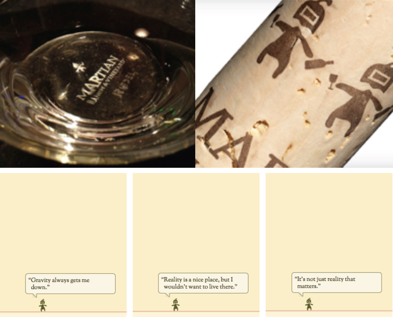
Then, when a site visitor goes to Martian’s landing page (no pun intended) for longer than 30 seconds, a tiny Martian character beams itself onto the site. It shares random thoughts like “Reality is a nice place, but I would not want to live there.” Needless to say, the Martian hunt was on and the buzz quickly spread, one glass at a time. All it took was one extra layer being subliminally added to the design language.
You need to dig deep into the core values of your brand. Is it humor, like Martian, or is it choice, like Baskin-Robbins? Incorporating hidden design language that speaks in unison with your brand values is useful and cost effective; you’re already going to pay to develop your brand’s identity and visual atmosphere.
Let the cleverness of your brand speak quietly, and you will hear the echo from your audience.
4 Ways to Maximize a Branding Tool You Are Already Using Every Day
An edited version of this article was originally published on Entrepreneur on June 25, 2015.
Rarely given much thought in brand creation or marketing efforts, your email signature can sometimes be seen by hundreds of eyeballs on a daily basis. Once you start thinking of this rather minuscule part of your communications a little more strategically, you will see how it can easily turn into an important branding tool with a build-in and engaged audience — a tool that is personal and, yes, free.
Your signature can further engage current clients and partners or educate potential clients and employees about your brand’s mission and culture. Working with entrepreneurs day in day out, I always stress the signature as the most simple, yet most overlooked brand asset. Usually it is being greeted by a “deer in the headlights” type of aha moment, one that I would love to project upon you by sharing four incredibly easy ways to push your brand upwards, while sending your emails outwards:
1. Resurface or re-purpose your tag line
The tag line used to be one of the key brand communication tools. Things shifted and today tag lines often end up being the headline on your landing page or used in certain lock-ups of your logo only. It’s time to celebrate your tag line again. It is a clever elevator pitch in a few words that quickly describes your brand’s purpose, and the email is the perfect piece in your marketing mix for it to live, be shared and live on happily ever after.
2. Showcase all of your brand’s active social-media channels
This one’s a no-brainer. Now check your signature and make those updates to ensure all social brand channels are indeed showcased as there are new ones popping up faster than you can read this article.
There is no easier way to gain followers that care. Period.
3. Leave them with your genuine thoughts, not a dead man’s quote
People are over the inspirational quotes and they don’t need to know you message was sent using your iPhone, tablet or even smartwatch. Instead, use your signature real estate to highlight the latest blog post you wrote or share interesting news of your brand – another way to create more touch points. Remember that you already have the attention of a reader, and she is only one click away to learn more about your brand. The “leadership area” of your signature as I like to call it, can be individualized by department or receiver, too. This can ensure the information is personal and relevant.
4. The more data used, the more important design becomes
All said and done, ensure your signature is not overwhelming. It needs to always be the second read after your message, even when you reply to an email with solely the two letters “OK.” The signature should always feel just like that: a place to either grab a phone number or address from or to further engage with your brand; the latter you will now have successfully achieved.
To further help you visualize these tips, I am equally reluctant and happy to share with you my E-Mail signature, as it reads of June 22, 2015.
That being said, signed truly,
5 Ways To Create A Timeless Brand
Creator, the beautiful online magazine of wework, the highly inspirational community of creators, published an original article by yours truly yesterday, so I thought sharing is caring. It goes something like this:
If I say “Coca-Cola,” you probably see the cursive typeface, red and white colors, curved bottles, and polar bears, right? That’s because Coca-Cola has spent decades building its brand with precise imagery, a consistent logo, and steadfast messaging.
While Coca-Cola is the quintessential timeless brand, many entrepreneurs have a tough time replicating its success because they’re drawn to the latest fads. Unfortunately, that’s not the key ingredient for enduring the test of time.
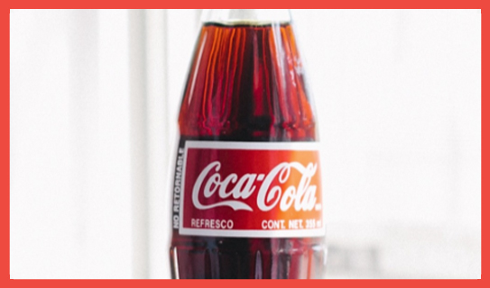
Photo credit: Lauren Kallen (Via Creator)
Styles change, but your company’s name and logo should not. You need to get it right from the beginning so you won’t confuse your target audience. It’s imperative that you create a brand that reflects your company’s values and is based on a shared passion with your target audience.
The brand that stays top of mind with consumers is the one that was built with “soul,” is driven by passion, and is marketed truthfully and consistently. A brand like Coca-Cola is truly timeless. Despite shifting marketing and advertising efforts, the brand is always surrounded by its unmistakable logotype and color scheme.
So how do you build a timeless brand? Here are five tips to get started:
- Buck the trends. If it’s in the moment, it’s unlikely to be in the future. Trends don’t hold up over time. People want something that stands out. A trend is cool for a very short time, then it quickly turns into an annoyance. The more honest and creative you are when crafting your brand identity, the more likely it is that you’ll create something timeless.
- Find a unique angle. If you try too hard to be like everyone else, you won’t be able to define your own unique brand identity. Look beyond your competitors, and dive deep into your own beliefs. Nail down what you’re about as a company, basing it on your core values, then determine how you want to communicate that to your target audience. Once you decide exactly what message you want to get across to your audience, you can create a truly unique visual and verbal brand language that’s lasting.
- Define your brand. A timeless brand has a shared passion with its audience. For example, Patagonia makes clothing for people who love climbing, skiing, and other outdoor sports that don’t require a motor. The brand caters to anyone who likes to connect with nature—hence it was able to expand from climbing gear to items for all other outdoor activities without losing its focus. This shared passion is directly reflected in the company’s sales because saving Mother Nature equals saving its audience’s playground.
- Be consistent. Your company name and logo are the first things that people will think about when your brand comes to mind, so keep them consistent. Make sure your logo is distinct, easy to adapt across different media types, and reflective of what your product or service actually delivers. (Hint: As you can learn from Zappos, it’s happiness, not shoes.)
- Avoid being too descriptive. When launching your brand, stay away from a name or logo design that’s too descriptive to avoid costly rebranding as your core focus shifts in the future. The uncertainty surrounding a rebranding effort could cost you time, money, and even loyal customers. At the very least, you’ll confuse them—as we recently saw with Airbnb’s rebrand PR nightmare.
When you solidify your brand from the start, you can focus on stabilizing it and investing in it. A brand that’s in unison with its identity remains relevant over time, and every party involved knows why the brand looks, walks, and talks a certain way. Base your brand on your unique offering, and connect with your audience meaningfully—you’ll be well on your way to developing a timeless brand.
Make Your New Brand Image Bland And Unmemorable
…was the advice I gave an entrepreneur last week. Wait, did I just really say this out loud? Yes, and here is why:
Like many entrepreneurs at the early (very early) stage, he was at a point where he needed to have a brand presence, just enough to get him through meetings looking legit. A business card in hand, a Powerpoint design to show and a web site to link back to. He was at a point where he needed to discuss his new venture in a professional manner with potential collaborators to further shape his concept. There was no outside investment and the core of the company strategy could sway depending on these initial meetings. It was not a time to invest in brand design, it would put the cart in front of the horse. So what to do?
There was no way for him to create the brand design the right way, so instead of applying any kind of distinct design language (making it memorable), he thought to make it “meh.” Make it bland, make it colorless.
I sincerely agreed. In this very rare case you actually do not want your brand image to stick in your customers minds.
People should be educated about what you do and who you are, but you should not create a memorable brand design and language around a very early stage concept if you know it will all change, very soon. Once the startup strategy is formulated, the brand can be shaped.
So go out there and have them call your number rather than recall your brand image.
The Secret Behind Big Brands And How Entrepreneurs Can Learn From It
This was one of many topics I was asked about by a croatian startup site prior to the speech I gave two nights ago at the University of Zagreb for the Founder Institute. The interview was published in croatian, which you can peruse here if you speak the language (and want to analyze and help me understand why the Backstreet Boys invaded my Brand Atmosphere), but for the rest of you, here it is:
Startups, especially the ones you will be talking to in Zagreb, are mainly in their early stages. Do they even need branding in that stage? If they do – what kind of branding do they need?
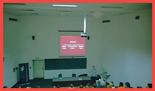
Fabian Geyrhalter speaking at the University of Zagreb for the Founder Institute, October 22, 2014
How can you brand yourself online when you are still a small startup, with a very small team and a limited budget?
When is the right time to hire someone (or a company) to help with branding?
Can you put together some sort of “emergency branding kit” for startups? What would that “kit” be made of?
It gets really difficult for a startup to choose their company name. It has to be unique, it has to be international, it needs to mean something. How do you achieve all of that and more with just one word?
How can a startup’s target audience help with forming a brand? What kind of feedback can that audience provide and how can a startup brand create an emotional connection with their potential customers?
What is the secret behind those huge, well known and beloved brands and what can small startups learn from them?
A Much-Needed Layer Of Protection For Your New Venture
A startup is vulnerable; very vulnerable.
They will notice.
They will steal and copy.
They will undercut your price.
They will be bigger and more powerful than you.
Welcome to entrepreneurship!
Your startup has many weak areas that require protection
Despite the idea of branding being about positioning, image and voice, for new ventures branding provides something of much greater value: A thick layer of protection.
Launching your new venture as a brand provides a thick layer of protection
With a startup product or service you may be so intrigued by its novelty or functionality that you decide to make a purchase.
With a brand you fall in love, and love is a strong word. Love does not fade easily. Once you created love, you will compete on a much higher level, one that is not about price. Your initial customers – the ones you have to fight so hard for to gain in the initial months upon launch – will quickly abandon ship for a cheaper variation, or a competitor’s added feature, if you did not make a conscious decision to invest (time and money) into the process of translating your startup into a brand at time of launch.
Branding for new ventures is first and foremost about an emotional connection, a strong immediate bond, between product/service and person (the customer). If you make that happen, you can sit back and let the competitors come your way; you are protected.
Let me know if you have questions about turning your startup into a brand, or if we can assist hands-on. You can also use our rather vast library of resources. However you go about it, start creating that layer of protection around your new venture; you will thank me later.
Your Brand In Today’s Age Of Digital Transformation: Let’s Take This Conversation Offline
The more online your brand, the more digital your product, the more offline you should think.
Let me explain.
There is an obvious backward trend happening: Kids love cheap plastic skateboards again. All the hard work of creating gears for bikes is thrown out for fixies, and the hottest Silicon Valley investment is…artisanal coffee shops. Small batch gin producers are next in line. Stihl chain saws only sell through their own little stores, 8,500 of them in the US. You won’t find their products online or at major home-improvement stores, and it’s working great.
Why? Because today offline is special, it is different. It is tangible and it is memorable. You don’t ‘like’, but you actually truly enjoy a brand. You don’t hit ‘share’ like you hit snooze on your alarm clock, instead, you have a real conversation with people who trust you about a brand. Now that we are all well versed with pay-per-click ads and (finally) Social Media, it is time to hit the Pause-button and think about what it is that makes your brand special and how to best engage with your audience in your outreach. How will you create memorable, perhaps even inventive, inspirational campaigns?
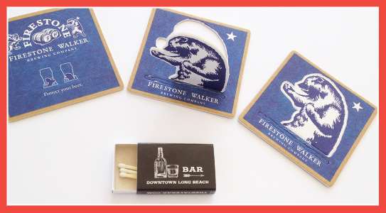
The best place to look for inspiration is in the most offline of places: Bars. Firestone Walker’s beer coasters (above via crappy iPhone photo by yours truly) are every bit on-brand, while starting a clever conversation about defending ones beer. Remember grabbing matches in restaurants on your way out, back when we were all smoking like chimneys? As we changed our habits, so have restauranteurs and those fun and useful souvenirs have all but disappeared, making them a novelty now. A local bar down the street from our office goes back to basics by offering matches (pictured above) with the most rudimentary and anti-brand (hence memorable) call to action.
Traditional marketing indeed can be seen as a novelty today, and if treated in a unique way, and matched with the core values and personality of your brand, you might agree that retro is the new now, and offline the new online; even for your digital-first brand. If you can pull of ‘the matchbox trick’, remaining on your customer’s mind daily for months, I let you crunch the big data numbers on that one, but I feel you’d see a new type of ROI. So when you gear up for your marketing outreach, perhaps go single-gear and stand out instead.
The Number One Reason Customers Will Be Attracted To Your Brand
To find out, ask yourself this simple question:
What Is Your Brand’s Scent?
I am not referring to the overwhelming perfume infused air you have to walk through when entering an Abercrombie & Fitch store (a scented brand environment). I am talking about the metaphoric scent your brand emits to attract, distract, or utterly confuse your audience.
During a delightful call with Stuart MacDonald (Freshbooks’ CMO) earlier this week, Stuart used the word ‘scent’ when we talked about branding. It really hit home. Like animals, we are attracted to scents, in the literal and metaphoric fashion. Nike emits the scent of inspiration and innovation for athletes, Oprah the scent of belonging and community.
When thinking about your brand, and why customers will be attracted to it, think about what scent your brand has. It will make you think beyond logo, beyond copy, beyond imagery and campaigns. You will have to take a step back and start to interact with your brand from afar, as if it was the very first time you ever ‘smelled it’. I hope it smells like roses, unless roses are not really your brand.
The closer you will get to your brand, the stronger and more intense (= focused) the scent will get, and once you are deeply immersed in it you will realize if you are in fact emitting the right scent altogether. It’s powerful. Try it today and let me know how it educated your actions.
How Oversharing Creative Options Will Hurt Your Brand (On Hand of The Worst Magazine Cover Design of 2014)
When I was 8 years old I started ‘a publishing house’. I named it Buttersemmelweich Verlag. A real memorable name, right? It translates to ButterBreadSoft Publishing Co. It only published a single magazine, but over the course of several years. It was called SNOOPY. Go here for a stunning visual I dug out from the family archives just for you. Please note the Nike logos on Snoopy’s shoes, a sign of innocence lost and a hint of my future in branding. Perhaps the Charles M. Schulz Museum (which I can highly recommend a visit to) will sue me for the 6 issues I sold – yes, the young entrepreneur that I was I actually asked my family members to pay for my work. Just like a retainer, each issue I drew and wrote was copied 6 times (by my mum) and always sold out (to my mum Etc). As I grew a year older the name of the magazine was changed to JoeCool, an obvious transition, and I brought on ‘a partner’ as one ought to do, especially since I could not use the typewriter yet. My fascination with magazines grew over the years. As a young communication designer I felt the need to be on the forefront of pop culture, to be informed about as many topics as I possibly could in a swift and constant manner, while being surrounded by the freshest fonts and layouts. Since the internet has not quite been as giving back then as it is today, buying as many magazine subscriptions as possible was my goal. I have since adjusted my subscriptions, but have not kicked the habit. Needless to say, I have seen (and over the years also professionally designed) plenty of magazines.
As I descended into the current issue of Bloomberg Businessweek a couple of evenings ago, I was shocked before I could even flip to Page 2. The cover was bad. It was so bad that it was actually appalling to me. Judge for yourself:
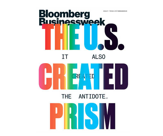 I was shocked, not a bit intrigued, only shocked, and a little sad as Bloomberg Businessweek has been pushing its design steadily after its acquisition in 2009. Conceptual, socially challenging and often shocking cover designs were part of their re-branding. But this cover is just shockingly bad.
How did it happen and why would you care?
Bloomberg Businessweek shares the story on how the covers were conceived in each issue, on Page 2, right next to the index, a prime location for any magazine. So here it goes:
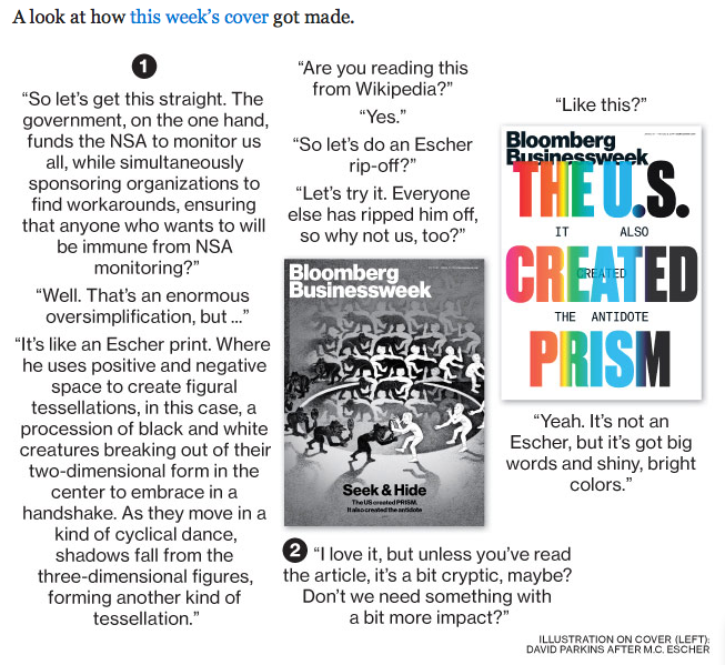
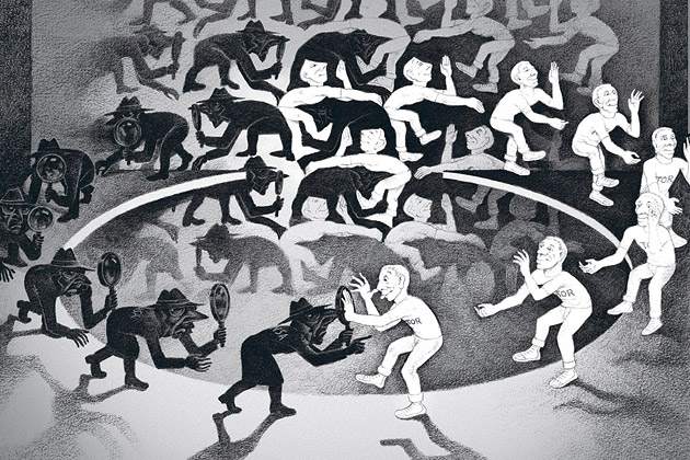
Image Source: Bloomberg Businessweek
Yes, indeed they talk about ripping off MC Escher – and may I add that the original design (above) also has a touch of Spy vs Spy ‘borrowing.’ Alright, I registered that as a bizarre strategy statement, but going from a solid conceptual and surely intriguing (yet copied) design to a horrendous – ‘at least it’s got big colorful letters’ – solution makes it obvious that the chosen design option only made it to the cover in a rush to meet print-deadlines (imagine how long the Escher illustration must have taken to create?).
As the reader, a consumer, the target audience, do you see the problem? Sharing both designs and the decision criteria is a very bad brand decision. If the cover design is genius, Bloomberg Businessweek’s story on how it was made is only killing the magic. No room left for imagination. Even worse, we can see how bad the other cover design option was, making the amazing design option that much less great as we want to feel designs go from good to better to great. If the design is really bad (as it is in the current issue) and the option that did not make it would have been significantly better (as was the case in the current issue), the reader is upset and disappointed by Bloomberg Businessweek’s choice. This is obviously not good for a brand and I see this as an open letter to Bloomberg Businessweek to change its strategy and to use this Page 2 real estate for something that works for, instead of against, its brand.
As an entrepreneur, never share your design options with your audience at large. It’s tempting as they are the ones that will need to buy (into) it. If you really don’t trust your brand or design consultants, have a small and narrow focus group, if you must, but do not share design options with your entire audience. Not during, and definitely not once they have been made. Most everyone who did not go through design college tends to screw this up big time. Look at Marissa Mayer’s big fail when introducing the public to Yahoo!’s logo re-design last year. Everyone got excited, everyone had their favorites, and then…a universally disappointing final choice.
The habit of sharing creative options is one of over sharing, or TMI as one would text. Don’t fall into this invitingly open trap as your audience’s TMI feeling would very quickly morph into an OMG and a WTF (Excuse my language) expression on your end. Spare yourself, and your brand that pain.
How to Leverage the 3 Core Components of Your Brand Identity to Enhance Messaging
When we think of brand we first think of logo (even though we know a brand is much more than its logo). The logo is the key point of visual interaction with a brand, hence we are likely to recall it every time we think (or talk) of – or write about – a brand.
During the brand identity (‘logo‘) design process entrepreneurs often forget that there are 2 other elements that help tell the company or product’s story. They interact and bring value to the brand identity as a whole. Do not repeat the same message, but instead ensure to leverage these 3 core components to create a stronger, deeper brand message:
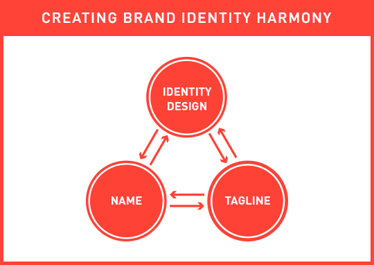
The 3 core brand identity components need to complement each other, each adding something unique to the whole story, and together forming a cohesive and strong initial brand message.
If your name describes your business, do not focus on showing the same message in your logo; instead use your logo to talk about other key elements that describe and differentiate your business. If you are in the cloud storage business and your name includes the two words cloud and storage (A bad company name, yet good example: Cloud Storage Ninjas), have your logo visualize security and stability, if those are key components of your brand’s message. Contrary, if your name is nondescript, either fabricated or an acronym, ensure that the associated brand identity design visualizes what you are in business for (EG: “Cloud Storage“).
Often forgotten during the brand identity design process (and beyond) is…the tagline. There are many factors to blame for the slowly occurring extinction of the tagline (mainly of digital nature, as tag lines are hard to squeeze into apps and templated web sites), but the power of a great tagline is still immense (Just do it, I say!). The tagline should be alive and kicking even though its placement has changed (from the traditional place below the brand identity design). It can now be used as the first header users see on a brand’s web site, the descriptor below the company name in an email signature, in place of yet another step-and-repeat icon pattern on a back of a business card, or in the often underestimated – yet early – brand touch point, the lobby of a business. The tag line is a powerful tool, that, together with the name and brand identity design, tells a stronger, deeper and more actionable initial brand story. It is a leading actor and you can write the script.
Keep the bigger picture in mind when embarking on your identity design project and use your Brand Platform to ensure these 3 core elements touch on more than just one or two of your core values and differentiators (while keeping it visually simple).
Next week I will talk about why our identity design looks the way it does. Are we not following our own rules, are we lazy, or is there a different strategy at play? Hint: It’s the latter.

The Post Host
Fabian Geyrhalter is the Principal of FINIEN, creating clarity for brand transformations.
JUST RELEASED
Key branding lessons to save time and money while winning hearts and minds.
CRITICALLY ACCLAIMED
How to turn any venture into an admired brand
THE #1 BESTSELLER
How to Launch a Brand