Tag Archives: Showcase
Don Joaquin
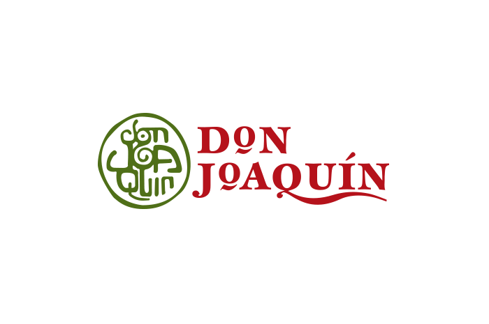
Don Joaquin Identity
Anticipating the arrival of its guacamole import into the US, the brand for Don Joaquin was inspired by the Aztec tradition and infused with modern ingredients to make it pop off the shelves. Authenticity was top of the list as we derived this iconic brand identity that blends tradition with a swirl of guac in the center of its medaillon-esque logomark. Soon after its introduction to the U.S. it found its way to millions of consumers through the aisles of Costco.
CATEGORIES:
Co-opportunity Natural Foods
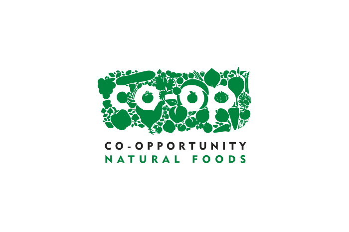
Co-opportunity Natural Foods Identity
Co-opportunity has been ahead of its time by providing natural, organic, and local foods to the Santa Monica area since 1974 (and it’s a co-op – take that, millennials!). With the explosion of natural food markets around the area, it was time to make a change in brand image. We were tasked to create a unique identity that spoke to the brand’s values of better food and stronger communities. Given the nature of a co-op, we were faced by thousands of decision makers alongside the design process, so we had to ensure a home run with the community. The artistically crafted logo shows that there would be no co-op without the natural products and the people that farm and purchase it; the co-op would not exist – the word is white-on-white without the surrounding products. A home run it was, and the rollout across the store’s brand atmosphere touchpoints clearly showed the adaptability and scalability of the newly crafted brand identity.
CATEGORIES:
Grossman Design & Construction
Grossman Design & Construction Identity
This identity re-design for Grossman Design and Construction was initiated to reflect the growth of the company. The use of its initials to create a modern three-dimensional structure was our solution to show craftsmanship and a focus on modern design while projecting the scale of projects that GDC was setting out to undertake.
CATEGORIES:
Big Boom Media
Big Boom Media Identity
This identity was created for the brand launch of Big Boom Media, a startup specializing in SMS messaging advertisement. The brand image was created to show the explosive viral nature of Big Booms’ work through a sleek, engaging, and ever-expanding identity design that was carried through various brand atmosphere touchpoints. Since launch, Big Boom Media has developed a reach of over 4 billion wireless subscribers, translating the identity’s visual claims into tangible reality.
CATEGORIES:
Bandito Brothers
Bandito Brothers Identity
When we were approached by motocross legend Mike “Mouse” McCoy with a bold vision of creating a new kind of action-focused content creation and production studio, we knew that the brand identity would have to be something extraordinary. The sunrise, the banditos, the coyote, and the bike together turned into a legendary visual in and around Hollywood as the studio took off creating blockbuster box office films and commercials for Fortune 500s. While the visual and verbal language could have easily turned gimmicky and unauthentic, it was important to never slide down that path: Exceptional dedication to the brand atmosphere touchpoint designs through gold foil and other superior paper and fabric choices along the way ensured that the icon and its just as iconic typography became a symbol for out-of-the-box creativity and badass stunt performances.
CATEGORIES:
Survios
Survios Identity
Brand Identity Design in partnership with the team at Survios, a revolutionary tech company focusing on virtual reality gaming and immersive entertainment research and development. The symbolism will remain a mystery due to the confidential nature of this fast growing VR company, but give it a second and you might realize a few strategies that have been derived to equip this bold startup with the lasting icon it demanded.
CATEGORIES:
Audiolife

Audiolife Identity
Our brand launch for direct artist-to-fan music fulfillment service Audiolife created visually powerful, dynamic, and intuitive results for its 300,000 users, ultimately leading to the acquisition by the top ranked distributor. ‘The power of music’ was given back to artists and fans alike and was successfully communicated through an iconic brand identity. When there is one key message of empathy, don’t hide it. Shout it through the identity, and the tribe will proudly support, wear, and tattoo it. Yes, this was that kind of iconic logomark.
CATEGORIES:
California Community Foundation
California Community Foundation Identity
The California Community Foundation, a 100-year-old organization, holds nearly $1.5 billion in assets making it one of the largest community foundations in the nation. We were hired to undertake a large-scale re-branding effort to re-envision the brand identity and align it for the next decade to come. Signifying growth, stability, and origin (California) was the center-piece of the brand identity design and its iconic mark. Growth was shown through the green pillar that angles upwards, while sunbeams – or a wave – creatively nod at the origin of the foundation. 5 lines signified the 5 core values. Nearly a decade later, CCF still uses the icon we crafted as a visual translation of their wonderful and inspired organization.
CATEGORIES:
Park Tahoe Inn

Park Tahoe Inn Identity
Tasked to create a brand identity for a remodeled hotel in beautiful Lake Tahoe, we knew we had to find a way to showcase the majestic area in the most simplistic and modern manner, while standing out from the sea of hospitality logos in vicinity. Within the simple typographic identity, we focused on the elements of the lake as well as the mountains: the key attractions that draw visitors to this majestic area on the Nevada-California border year-round. The brand image was carried through all brand atmosphere touchpoints and continues to inspire guests to indulge in the surroundings of its beautiful location.
CATEGORIES:
Striders

Striders Naming
This San Diego-based startup set out to create a unique entertainment experience, combining great tasting, casual dining, classic cocktails, craft beers, and a unique high-end Las Vegas-style Turf club lounge. The name Striders was crafted to hint at the horse racing portion while making it easy to refer to as a location in conversation. It further evokes the casual club lounge with a sense of motion and urgency, while lending itself to a scalable brand concept.
CATEGORIES:


