Tag Archives: Showcase
YelloUmbrello
YelloUmbrello Identity
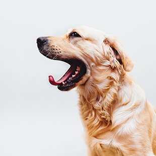
Crafting the brand identity for this new high-end chain of pet groomers, we knew we needed to shake things up with a dash of unexpected color and a playful, memorable and unique name. And of course it had to be damn cute, without that grooming kitsch with which we are all too familiar. While cats and dogs found a safe place under the yellow umbrella (yes, it’s how we tricked them into getting a good wash), the brand atmosphere touchpoints found its differentiation through strong color and icon-language.
Yelloumbrello Naming
The name for this high-end pet groomer was derived from the notion of pets getting a good wash, which many canines don’t list as their top ten things to do. The fun name YelloUmbrello defined how different the groomer was, while it also alluded to the franchising model (a brand umbrella). Most importantly though it created a sense of trust, ensuring pets were in a safe and clean environment. We also joyfully crafted the tongue-in-cheek tagline ‘Happiness is a pampered pet.’
CATEGORIES:
Match Creative Talent
Match Creative Talent Identity
Creative talent agency Match chose us to spearhead an all-encompassing re-branding effort of the firm’s dated identity system. Our solution revolved around the symbiotic relationship of talent and hiring party, the foundation of the company. Each letter consists of two parts that make it work, that hold it together, that create the company. It talks about co-dependency as much as leaning on each other to successfully fulfill a task. The symbolic letter A turned into the scalable icon while alluding to the transformation into a digital-first workflow (the hint of a cursor) that Match embarked on at the time of the re-branding. Match Creative Talent got acquired by Onward Search a few years after the re-branding initiative.
Fabian and his group did an outstanding job on re-branding my company. I would recommend FINIEN as a very strong brand design firm and will continue to use them for our ongoing needs.
– Mark Armstrong
Owner
CATEGORIES:
Thumbroll

Thumbroll Identity
Thumbroll is a Los Angeles-based medical education startup. The app allows medical students to learn critical techniques and procedures at their own pace through a proprietary scrolling functionality. The iconic mark represents forward motion while resembling a shifting pause button, thereby combining the two key points of the user’s brand experience. The identity design further alludes to the relationship between medical procedure and the medical student and uses contrasting blue tones that fit into the vertical while resonating with the next generation of students.
CATEGORIES:
Jackery

Jackery Tagline
Jackery hired us for a Resonaid™ brand strategy workshop in Silicon Valley. As we defined the values, personality, and analyzed long-term plans, we ended up diving deeper into the emotions of the target audience. The biggest epiphany translated into a tagline and advertising concept that is now being used nationally. It hones in a target group that is seeking Jackery to ’empower their lives on the go.’ It sure empowered the brand story, marketing, and subsequent growth. “What a difference a day makes,” to quote Her Majesty Dinah Washington.
CATEGORIES:
Benevido
Benevido Brand Strategy
Entering a crowded space of instant coffee – with the added benefit of natural plant-based ingredients – Benevido sought us out for assistance in the creation of a strong positioning and brand presence on the shelves. Throughout our one-day workshop we focused on the behavior of consuming instantaneous coffee, a quick fix in people’s busy lives. A habit that is fueled by short-term benefits is now being furthered to additional long-term health benefits. This became the foundational story that fueled our long-term vision for brand name and identity.
Benevido Naming
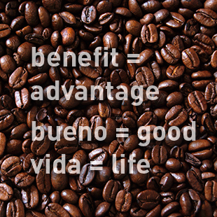
Based on our findings from the brand strategy phase, the name for this instant coffee startup needed to fuel long-term benefits while being internationally feasible and memorable. Benevido was derived from the words ‘benefit,’ ‘bueno‘ (’good’ in spanish) and ‘vida’ (’life’ in spanish) to create a brand name that is easy to pronounce, ownable, and automatically conveyed the brand’s values.

Benevido Identity
The identity for instant coffee brand Benevido instills the philosophies and values that the brand emulates. Dynamic curves and swoops create movement that emulate growth, signifying the long-term health benefits of Benevido’s added natural ingredients. The communal aura brings thoughts of rejuvenation and a celebration of life. A coffee bean in perspective ties the identity together and hints at the contents within.
CATEGORIES:
QBase
QBase Identity
The brand identity derived for data management company Qbase focused on the firm being ‘the connecting element’ as well as an overall elevated look to disrupt the IT segment as it launched over a decade ago. We were tasked to establish a visual identity evoking trust and commitment on a global manner for its clientele of Fortune 500 CTOs. Today, Qbase has 250 clients in 18 states and three countries, including the US Air Force, and we are proud to have played our part in the early successes of the company.
CATEGORIES:
SpeakBeat
SpeakBeat Naming
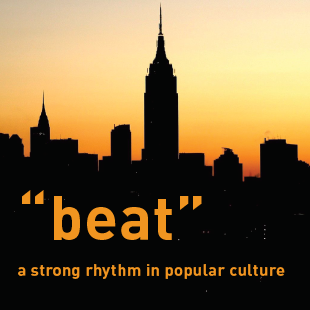
We were tasked to derive a name for a mobile app that allows for personalized interactions with trending topics, news, and ideas through the answering of questions. The name was required to resonate with millennials, be used as a common noun or verb, tell a story and that trademark and domain names were available. With SpeakBeat we hit on two key aspects of the app: Voicing your opinion and being part of the pulse of now. It also allowed for additional brand nomenclature while being memorable in a beat.

SpeakBeat Identity
The SpeakBeat identity design is multilayered in symbolism deriving from social complexities of community diversity. Multiple bars, in varying heights, assemble next to one another to represent the community as one. Height differences mimic a cityscape, sound bars and the pulse of the community. Each of the bars also represents a speech bubble, the correlated opinions that make SpeakBeat, beat.
FINIEN did an outstanding job assisting SpeakBeat with our branding needs – from the creation of the name to the development of the brand identity.
– Dean Stackel
CEO
CATEGORIES:
Adorista
Adorista Brand Strategy
Adorista is a gift box service celebrating Korean fast-fashion accessories. The brand strategy workshop moved the idea from a gift box opportunity into the creation of a tangible feeling of belonging for 12- to 22-year old US-based girls. Adorista allows them to feel like fashionable K-Pop stars without having to spend a lot of money and time, or to openly share their love to K-Pop, which is a niche phenomenon. [As a pre-launch startup we are restricted in the strategy information we are able to currently share]

Adorista Naming
One part ‘Adore’ plus one part ‘Fashionista’ turned into this catchy name that allowed the company to create Adoristas out of their fans. We established trademark clearance and ensured domain name availability.
Adorista Identity
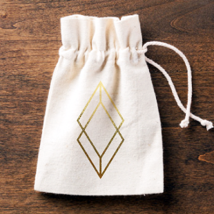
The Adorista brand identity was created to convey the feelings of fast-fashion luxury while creating an approachable and current fashion-centric brand image. Jewelry was visualized through the use of a diamond shape, the subliminal 3-D box effect alludes to the box that subscribers receive at their doorstep each month. We extended our services and art-directed photo and video shoots while creating the initial digital and box designs.
CATEGORIES:
Martian
Martian Brand Strategy
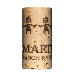
Martian approached us with an inspired winery name, derived from the owners’ sons (Martin and Ian), and backed by an exceptional vineyard location and talented winemaker. What was missing was the brand strategy, identity and design. We set out to create the brand as it launched into the saturated California wine market in midst of an economic downturn. Offsetting the obvious (characters of Martians) with brand surprises and drafting stories of authenticity and quality as part of the brand launch were key findings of our strategy phase. We advised to use a rather generic Martian as a surprise that needed to be sought out by the ones interacting with the brand. The character hunt became part of the brand story in true alien-fashion: When visitors roamed around the tasting room property they were greeted by them in random areas of the vast property, the Martian was etched into the bottom of the tasting glass, visible only upon final sip. The tribe loved the Martian hunt, while the hidden character ensured to not dilute this brand of fine wine.
Martian Naming
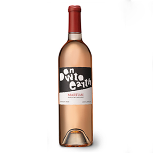
As part of a special label series for this California winery, we put our heads together with the proprietor and together derived names ranging from Down to Earth, Mothership, Ground Control (hello, Major Tom?) to Uforic to tie in the otherworldly quality of the wines (and, yes, the name) with the qualities of the grapes.
Martian Identity
The typography-based Martian Ranch & Vineyard brand identity used an existing serif typeface that was redrawn by hand to lend an authentic, organic, and otherworldly feel to it. The deep red wine tone seemed especially fitting as the name itself recalls the red planet. The Martian character appeared nowhere on the label, only on the cork once the bottle was opened (Martians playfully handing each other refills).
FINIEN’s creativity and attention to detail are invaluable to the success of our winery. From brand identity through design their service is unparalleled.
– Michael Roth
Winemaker
CATEGORIES:
Innopri
innopri Naming
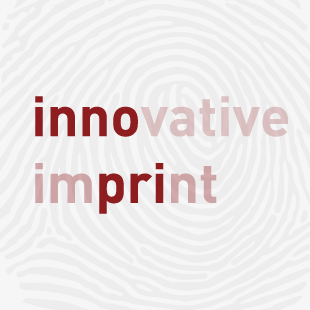
This San Diego-based HR consultancy startup approached us when the founder realized that working with major tech clients demanded a name with energy. The name Innopri was derived from a mash-up of the terms “innovative” and “imprint”. The term “imprint” connected with the client to leave a positive impression (or “imprint”) on the client organizations, while innovation alludes to the consultancy’s unique process as well as the innovative nature of their clientele. A lasting imprint was crafted.
CATEGORIES:

The Post Host
Fabian Geyrhalter is the Principal of FINIEN, creating clarity for brand transformations.
JUST RELEASED
Key branding lessons to save time and money while winning hearts and minds.
CRITICALLY ACCLAIMED
How to turn any venture into an admired brand
THE #1 BESTSELLER
How to Launch a Brand