Tag Archives: Showcase
CO-OP THINK Brand Identity Suite
CO-OP THINK Brand Identity Suite
As part of our ongoing creative brand strategy engagement with CO-OP Financial Services, we were tasked to craft an overarching suite of brand identities for the inspiring THINK program: THINK – the year-round online thought leadership hub, THINK Review – The Magazine for Credit Union Intrapreneurs, THINK Prize – The innovation challenge, and last but not least the annual THINK Conference. Each stands tall on its own, while easily identifiable as a brand family.
CATEGORIES:
Five Dollar Traffic School
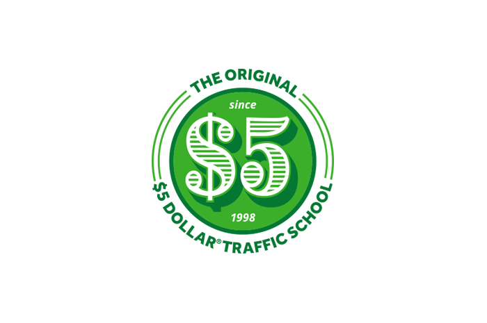
$5 Dollar Traffic School Brand Strategy
The founders of this California online traffic school approached FINIEN to strengthen their brand focus in preparation of a re-branding, which was also handled by us. $5 Dollar Traffic School provides a great online traffic school experience at only $5, as the name suggests. During our one-day Resonaid™ Brand Foundation workshop, we honed in on value, quality and experience, both from the student point of view as well as the brand legacy Five Dollar earned over 20+ years. Competitor brands using the $5 component created consumer confusion, so we decided to include ‘The Original’ in the name as well as to add ‘Since 1998’ as part of the visual brand.

$5 Dollar Traffic School Identity
Given that $5 Traffic School truly is only $5 (unlike others on the market) it was important for the identity to feel bold, authentic and true. The identity’s seal-like characteristics are to emphasize just that – a stamp of authenticity. A fat typeface was chosen for the numbers to resemble the all-familiar characteristics on the $5 bill. The true color of ‘money green’ is used as the primary color to heighten the confidence of $5 Traffic School being true to its name.

$5 Dollar Traffic School Tagline
Honing in on their key differentiator and the fact that the company firmly stands behind what their name suggests, we crafted the tagline “True to our name.” Another strategic move to educate the audience and stand out from the copycats in a highly competitive industry.
CATEGORIES:
CEF
Center for Expanded Families Brand Strategy
During the Resonaid Strategy Intensive we derived the friendly brand personality and strong core values while crafting a powerful story for CEF, a hub for key influencers in the lives of children affected by a change in parenting roles, that provides awareness, education, guidance and support to develop emotionally stable children. It does take a movement to craft the world’s next generation.

Center for Expanded Families Identity
The identity design signifies the key aspects of CEF: to create loving expanded families. The ampersand stands for the expanded family as well as for creating more love, more awareness, and support. The similar structure of the heart and the ampersand symbolize the essence of pulling out the love within expanded relationships. The heart is visually ‘expanding’ out of the ampersand. The two icons intertwine to represent the communication and collaboration CEF provides through our guidance. A bold, wide, rounded typeface was chosen for the name because of its friendly and approachable features, just like the service CEF provides.
CATEGORIES:
Wurrly
Wurrly Brand Strategy
Los Angeles based startup Wurrly is a free mobile app that transforms your smartphone into an on-the-go music studio with a fully customizable recording artist experience. We worked with Wurrly through our one-day brand strategy workshop to derive the brand’s personality, values, and better define the story. As sometimes is the case in these magical days, we also derived the tagline that day: RAISE YOUR VOICE; a line that speaks to the empowering opportunity for artistry and social sharing that Wurrly promotes.
Wurrly Identity
A dynamic brand identity for this rapidly growing startup that mixes music and tech to bring the ultimate karaoke experience to the app store. Based on the findings of our Resonaid™ brand workshop, we crafted a mark that touches on the universal nature of music and the concept of the ‘whirl’ as it evokes its musical feel. The brand radiates the idea of ‘connecting people through song’ – and the icon needed to ensure it does that in a manner that is easily understood by the target, while making it scalable for its key usage in an app and social media environment. The brand icon set the stage nicely for a startup that is seeing tremendous adaption by its tribe.
Fabian is extremely detail oriented and personable, he ran us through a branding workshop thereafter designed the logo. He and his team are easy to work – they listen and then think outside the box in a creative collaborative way. I found the entire process highly rewarding and would recommend them to anyone.
– Nadine Levitt
Founder & CEO
CATEGORIES:
Opal
Opal Identity
FINIEN re-launched Opal’s brand through all Brand Atmosphere touchpoints, creating a brand image that allowed the firm to compete on the national level of real estate investment and management. The brand identity design was the key asset, showing monumental strength and alluding to a three-dimensional element of impact and openness. The trustworthy typography and color mixed with the overall modern feel for this identity (created in 2007) ensured to stand the test of time.
CATEGORIES:
NGF
NGF Identity
The identity re-design for the Nikolaus Geyrhalter Filmproduktion, a Vienna based production studio focusing on documentaries, was a family affair (Nikolaus is the brother of FINIEN’s principal). The identity design represents the studio’s critically acclaimed cinematic style and focus. Fans of his films quickly turned into fans of this icon as it translated the emotions otherwise captured by his moving images.
CATEGORIES:
LazyHooks
LazyHooks Identity
We created the identity design for music production label Lazyhooks. You may know the guys behind this label better as Capital Cities, the band that broke our hearts and chart records with ‘Safe And Sound.’ The logo’s simplicity strikes a chord through the apparent hook and its playful nature. A safe and sound logo, in other words. And just like with all big hits, it ensures to remain timeless.
CATEGORIES:
Onramp
Onramp Identity
The hexagon and cube shapes in the icon represent Onramp’s expertise and thought leadership across its holistic ‘six-levels-of-insight’ approach to big data solutions, while also having subtle references to organic molecular structures. These six levels were uncovered and developed during a one-day FINIEN brand foundation workshop. The open spaces in the top right corner of the icon speak to the bridge or “onramp” that is being created to clear a path from latent data to fully visible and interpreted bioinformatic data. As a startup in the biotech space, this robust identity equipped the company to enter the world of big data like a big player in the field.
CATEGORIES:
The Mainstream
The Mainstream Identity
The Mainstream is a Los Angeles-based startup that serves as a commercial content platform providing users on-demand control over how they discover opportunities. The iconic identity serves the purpose of telling the story between user and advertiser through the shadow-play while creating the symbol of infinity for the endless stream of opportunities and possibilities within the platform. The upfront letter M ensures brand name recognition while allowing for scalability across the social media landscape. Not a bad mixture of ingredients for a startup that demands an iconic and meaningful brand identity.
It’s a pleasure to endorse Fabian and the entire team at FINIEN. With the almost impossible task of creating an easy-to-remember, global brand name, and URL, in a short period of time, FINIEN delivered not just one, but 4 great names – in their first attempt! In addition, we were very happy with the visual representation of our chosen brand name. Fabian Geyrhalter makes the process fun, easy, and they deliver on time. We look forward to working with them again!
– Rocky Hansler
Founder & CEO
CATEGORIES:
Mindshare
Mindshare Identity
Mindshare LA is “a mecca for intellectuals, artists, scientists and other forward-thinking characters looking for inspiration and connection.” We felt right at home crafting an identity for this inspirational event platform. The bold mark represents the space where opinions are being formed, transformed, and likeminded individuals meet through shared thoughts. The typewriter font used in ‘Los Angeles’ is a nod towards the creator community it serves. Given the nature of the brand, the icon was created to adapt to on-screen, projections, and name tags alike; and it has stood the test of time for nearly a decade.
The term ‘branding’ is overused in business today, with little discipline paid to either the concept nor execution of crafting impressions worth our attention. Fabian’s work is the opposite and makes business sense while upholding time-honored European design traditions of legibility, maturity, and precision. Organizations receive the level of design they deserve. Does your vision deserve Fabian’s quality?
– Adam Mefford
Co-Founder
CATEGORIES:

The Post Host
Fabian Geyrhalter is the Principal of FINIEN, creating clarity for brand transformations.
JUST RELEASED
Key branding lessons to save time and money while winning hearts and minds.
CRITICALLY ACCLAIMED
How to turn any venture into an admired brand
THE #1 BESTSELLER
How to Launch a Brand